
(Note: revised July, 2024)
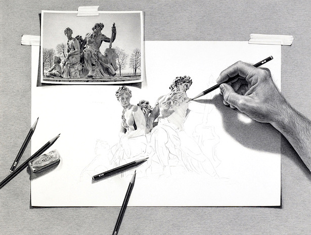
When I walked into Robin Lauersdorf's booth at the Cherry Creek Arts Festival in 2022 my jaw nearly dropped to the floor. Here at last was a visual artist that was creating something truly dynamic with pencils, something that I could see myself trying to create, or wanting to create, assuming of course that I have anywhere near the skills and imagination with a pencil that was needed to do so.
Lauersdorf's meticulously drawn, "Escher" inspired graphite illustrations are filled with playful illusion, and practically burst three-dimensionally from of each piece of deceptively taped down paper. They are remarkable too in that they are precisely detailed, yet non-cluttered and cleanly rendered. My wife immediately sensed that I was going to buy one of his prints and she was right, so instead she gifted me one as a birthday present. Yay!

This, out of the more than a dozen pieces on display, was the one I chose. They were certainly far more imaginative ones in Lauersdorf's booth, but this particular one, which happened to be one of his earliest drawings in the "Escher" mode, was just too attractive to pass up when I thought about how much I like this particular theme of ancient statues and sculptures. It felt inspirational as well, which manifested itself with my enrolling in several drawing classes since its acquisition.
Lauersdorf explained the history behind his so called "Self Portrait" this way: "Often, I am asked how I do my drawings, so I decided to create a drawing
that illustrates my process. I didn’t realize how successful the
illusion was until an older gentleman came up to me at an art fair and
discreetly told me that I had accidentally left my photograph taped to
my drawing! At first, I thought he was joking, but I had actually fooled
him into thinking the drawing was real. This incident opened my eyes
into the ways I could play with reality in my pencil drawings—the
gentleman had a much greater impact on my career than he will ever
realize!"
 |
CLICK TO ENLARGE
|
I almost bought this print too that day, and now wished I would have (although my wife wasn't too keen on the tentacles). But as fortune would have it prints of this drawing and most of his other works are still readily available through Lauersdorf's website, priced between $50 and $100 dollars (a link to it can be found further down this page). The image area of each print is 15 x 20 inches in size, although I think larger ones can be ordered. His original works vary in actual size and are priced between $4K and $18K. The above piece is called "Waiting For My Ship To Come In" and its backstory is interesting: First Lauersdorf had to build an actual model to photograph so he could get the lighting and shadows correct. It began by wrapping coat-hangars with paper towels and tin foil to replicate the Kraken's tentacles and bending each one to where they would be the most effective at reinforcing a three-dimensional illusion. Then the actual drawing began, starting with preliminary sketches. After several weeks, perhaps as much as two or three months, the final drawing was completed. As you can see, Lauersdorf has brilliantly included just the right amount of details to further the illusion that the Kraken was actually pulling the ship off the paper and into the water underneath. Also among the details are a floating barrel of rum and three sailors: one is rowing a boat, one is seized by a tentacle, and one is swimming away from a shark.
BELOW are a few more of Lauersdorf's finished creations, including a framed print of one of his many advantageous "University Drawings", showcasing its unique potential for alumni.


While visiting Lauersdorf's website, I found this informative statement from him:
"
To many artists, drawing is used as a preliminary means to an end.
Through years of meticulous work, I have tried to show that the pencil
can be used as an art form in itself.
Through close observation, I render my graphite pencil drawings as
detailed and realistic as possible. Without the use of color, my
drawings must stand on design and value alone. Opposed to pen and ink,
pencil allows me to obtain all of the subtle values ranging from very
light to very dark. Charcoal, being very soft, doesn’t allow for fine
details.
My subject matter often varies. I find that anything is interesting to
draw as long as I can be creative in the designing of the piece. The
designing process can take longer than the actual drawing itself.
Because of the detail, which I try to achieve, my drawings can take up
to three months before I feel satisfied. Like most artists, I have a
vision of what I want to draw and must research, photograph and sketch
until I have illustrated what I envision.
Ideas for my drawings come in many forms. In particular, I have always
been inspired by the work of MC Escher. Many of my pieces play with
reality and illusion like his did. I also create drawings of colleges
and universities across the nation that allow alumni to display their
pride in their institution."  |
CLICK ON IMAGE TO ENLARGE
|
Here's a beautiful painting I came across that speaks to Lauersdorf's broader output, and complete mastery of mixed media.
If you would like to order prints or buy an original piece of art from Robin Lauersdorf, you can do so through his personal
website. He also has a 12" X 12" hardback book of his art available for sale, titled
Wishful Thinking. It highlights 31 drawings intricately explained across 88 pages. It represents 15 years of the man's artistic life, offering insights into the inspirations and challenges behind each drawing. The cost is $74.

Escher's famous "Drawing Hands", seen above, is what helped inpire
Lauersdorf and countless other professional artists and illustrators. It
was drawn in 1948 when Escher was 50-years-old.
Escher
was a Dutch graphic artist who made woodcuts, lithographs, and
mezzotints (monochrome prints), many of which were influenced by his
love of mathematics. Escher was born in 1898, but it wasn't until very
late in his life that he garnered any real attention from the art world.
In 1970 he received his first retrospective exhibition, sadly though
just two years before his death at the age of 73. After his passing he
became widely appreciated by everyone, from publishers to comic
illustrators and fine artists. Since then his artwork has been seen
repeatedly on book covers, albums, magazines and possibly even
advertisements.
BELOW ARE a few "Escher" inspired book and
magazine covers created by other artists, including several which preceded
1948 that may have actually inspired Escher himself!
Beggar's Choice was written by British author Patricia Wentworth and published by Lippincott in 1931. The cover art is initialed J.R., but I have no idea who that refers to. Beggar's Choice is a standalone mystery and not related to the author's more famous Miss Maud Silver mystery series. Wentworth is actually Dora Amy Turnbull, born in India in 1877 but educated in England. Turnbull adopted the pen-name Wentworth along the way and published at least 64 novels, 32 of of which are Silver's. She died in 1961 at the age 83.
Detective Fiction Weekly was a popular, long running pulp fiction
magazine, publishing an impressive total of 929 issues over a period of twenty-eight years. It started out in 1924 as Flynn's and continued with
variations of that name for several years. The "Flynn's" part was
dropped in 1938 and it became just Detective Fiction Weekly, running for
another fourteen years. Eventually it became a bi-monthly and finally a
monthly before merging with Dime Detective Magazine. In 1951 the
magazine folded for good. This issue was published in November, 1932.
The cover artist is unknown.
The Shadow Magazine ran for eighteen years, between 1931 and 1949, publishing a total of 325 issues. Its crime fighting titular hero The Shadow (Lamont Cranston), had a huge impact culturally on the 20th century as both an image and an icon ("The Shadow knows!"), but in this new, ridiculous and often abhorrent 21st century where law & order, truth, integrity, decorum, and the past don't matter, he has become largely forgotten. And that's too bad because we need role model more than ever, even if some of them are only fictional. My first movie date with my wife was actually a remake of
The Shadow, starring an actor who's been in the news a lot lately, but for all the wrong reasons. Sadly, a role model he is not. The cover art on this December, 1933 issue was produced by
George Rozen, who essentially created all of the cover art for the magazine except for the first two issues, which were painted by his brother Jerome.
Counterfeit (Sears, 1933) was one of at least 60 mystery novels that Lee Thayer wrote. It featured her dapper sleuth Peter Clancy, who is always ably assisted by his valet, Wiggars. Lee Thayer (1874-1973), born Emma Redington in Pennsylvania, was also an illustrator, and in addition to producing this particular jacket art, produced jacket art for dozens of other novels. So far I've only read one book by her, Fatal Alibi (1956), but it has become one of my favorite mysteries.
'Three men are dining together in a brilliant New York restaurant.
Red-headed Peter Clancy, private investigator, is host. Raymond Trant,
of the Secret Service, and Captain of Detectives Kerrigan are his
carefree guests. As a matter of personal interest Trant tells them of a
wonderful counterfeit one hundred dollar bill that he is deeply
concerned in tracking to its lair.'
The Beast Must Die by Nicholas Blake was published in hardback by Harper & Brothers in 1938. The jacket art was produced by Leo Manso. Manso created jacket art for most of the major hardback publishers from the 1930s on, adding paperback houses to his client list in the mid-1940s. At some point later in his life he taught art at the Cooper Union for Advancement of Science and Art, and also at Columbia University and New York University. As a fine artist he was noted for his colorful abstract paintings.
This is the only image of Hood of Stars (Arcadia, 1940) that's currently available, a crummy one where it looks like the jacket itself has been compromised along the bottom edge during the printing process. There is no information online about the author, Winifred Wadell, but her name is attached to two other novels, Here Dwells Enchantment, Harp on the Willow, and White Shadows, all of which were published in the early 1940s by Arcadia House. As far as I can tell the jacket art remains uncredited. The following blurb was apparently lifted from the flap: "Yes, love is for little people," Sylvia said, repeating David's words.
"And some day I'll be a great ballerina. You'll hear of me and say:
Sylvia? Yes, I remember her. I could have married her- but I had my
career to consider!" But I shall be above and beyond any thoughts of
love. I'll wear a shining hood of stars, and nothing can touch me,
nothing can hurt me." They were sitting in a moonlit garden- Sylvia and
David- a girl and a boy saying goodbye."

Murder Enters the Picture, the fourth novel in the Christopher
Storm mystery series written by Willetta Ann Barber and R. F. (Rudolph Frederick)
Schabelitz, was published in hardback by Doubleday Crime Club in 1942.
The cover art and the books interior illustrations were all drawn
by Schabelitz. Barber, in collaboration with Schabelitz, wrote six mysteries featuring
illustrator and
amateur-detective Christopher "Kit" Storm, all published between 1940
and 1949. Schabelitz, a professional illustrator, mostly contributed
illustrations to the project, but they were apparently integral to the
story because some had actual clues embedded into them. A unique
approach to mystery writing for sure.
'Kit Storm, artist-detective whose on-the-spot sketches are important
in solving murders, was forced to cut short his honeymoon in order to
be saddled with problem of finding another murderer. Sherry, his
secretary and now his wife, assists as usual. Together they have to deal
with the perplexing question of how one could be stabbed in the back
while sitting facing one's murderer, [... ] the burning wheat
field, and the blood-stained page from a child's book. This is the best
book in a unique series in which illustrations are an integral part of
the story.'
Pencil Points to Murder, the second mystery novel by Willetta Ann Barber & R. F. Schabelitz, was published initially in this 1941 supplement from the Philadelphia Inquirer. I haven't seen the interior pages of this supplement so I can't be certain that Schabelitz's illustrations were included, but the cover art was not drawn Schabelitz and instead by Miriam Troop, about whom nothing much is known.
'PENCIL POINTS TO MURDER, the second fully illustrated mystery story, again shows how a clever artist observes the clues to murder and preserves them in his sketches made on the spot. Kit Storm knew from the way the body of Mary Boyd lay on the floor that her death was not suicide but murder, and his sketches proved it. He was ready with his pencil to catch the changing expressions of the people suspected of Mary Boyd's murder. His sketch pad guided the way to justice for a heartless, cold-blooded killer.'
Invitation to Kill, a detective novel by Gardner Low, was republished in softcover digest format by Crestwood Prize Mystery Novels in 1945, following its earlier 1937 hardback releases from Gollancz and Putnam's Sons. Gardner Low was a one-time pseudonym used by Australian journalist Charles Rodda (1891-1976). Rodda also wrote numerous thrillers under the pseudonym Gavin Holt, and collaborated with noted writer Eric Ambler on at least three espionage novels. The cover art is initialed F.W. Now, I'm not really sure who that refers to, but a left-field guess might be Fritz Willis, known primarily for his sexy pin-up women of course, but I'm pretty sure he produced some book cover art too. After a long career in which he won many awards for excellence, Willis taught art classes in his remaining years.
'Ross Farrier, commercial artist, was a success by almost any standard, with every reason to live. Yet, Farrier's body is found on the floor of his New York studio with an ivory-handled hara-kiri knife through his heart. There had been a wild party the night before, and there had been no love lost between the artist and a number of his hard-drinking guests. But would any of them have gone as far as murder?
INVITATION TO KILL would have been an exciting baffler told in a perfectly straightforward manner, but by the use of a clever technical device it becomes something more. The reader is taken into the confidence of the man telling the story, and, as the account of the murder unfolds, there are frequent glimpses behind the scenes. The results of this method are an added fillip of interest (the reader sees how a mystery story is constructed) and an opportunity for a completely unexpected solution.'

Rendezvous In Black by Cornell Woolrich was published in paperback by Pocket in 1949. Woolrich's brisk, unrelenting tale of revenge, ironically victimizing innocent people in its wake, is rather unconventional in its scheme, at least as far as the standard mystery fare of the era went. Woolrich, for those who may have forgotten, was the author of
Rear Window, which director Alfred Hitchcock filmed in 1954.
William Wirts produced the cover art on this particular paperback. Very little is known about him, except his name is often confused with that of William Wirt
z, an early 20th century painter. Our Mr. Wirts produced several covers for both Pocket and Bantam throughout the 1940s and '50s.
'HE MADE HER FACE LOOK LIKE THE PHOTOGRAPH'
"Turn this way a little," the makeup man said.
Finally he nodded. He had caught the likeness perfectly. He went over and opened the door. A little old lady was ushered in.
The girl turned slowly to face them.
A stifled scream escaped the old lady. She pressed her hands to her mouth, "Dorothy!"
In the Mink is a thinly disguised autobiographical novel by the late journalist and editor Anne Scott-James, her fiction debut. It was published in hardback by E. P. Dutton in 1952. The book chronicles a female journalist's trials and tribulations in a mostly male dominated field. If you are at all interested in strong literary women of the last century, you should google her 2009 obituary. Not much is known about cover artist
Jean Des Vignes, except that he was a prolific commercial illustrator, producing book covers for Dell, Dutton, and Macmillan, among others.
 |
CLICK TO ENLARGE
|
Al Parker illustrated the above short story that was published in the February, 1954 issue of Cosmopolitan magazine. Parker was an extremely influential and prolific magazine illustrator, and,
in addition to his many interior illustrations, produced more than 50
covers for the leading slicks of the time, including
Good Housekeeping,
McCall's,
Saturday Evening Post,
Sports Illustrated,
Vogue and
Town and Country. The author of story was the writer, novelist, editor and seaman, George P. Morrill, who in his younger years was dubbed "Right Rudder Morrill" for having run aground a tanker ship in the Suez Canal (while, ha ha, allegedly obeying the specific orders of his superior officer, who naturally went blameless).

On Her Majesty's Secret Service by Ian Fleming was published in hardback by Jonathan Cape of London in 1961. Richard Chopping produced the jacket art. He was a British illustrator and author of natural history and children's books. His most famous covers however are those that he did for Ian Fleming's James Bond spy thrillers, between 1957 and 1966. There were nine altogether, all similarly executed in Chopper's realistic, three-dimensional, trompe-l'oeil style.
"It was one of those Septembers when it seemed that the summer would never end..." But it did end and winter came in a lethal welter of mystery, bloodshed and multiple death amidst the snow. this, the eleventh chapter in the biography of James Bond, is one of the longest. It is also the most enthralling. Really the most? Really the most.'
No matter what theme I come up with, there always seems to be a "sleaze" paperback that qualifies for inclusion. Ditto here. The Sinful Ones by Don Elliott was published by "sleaze" publisher Nightstand Books in 1961. The novel was actually written by famed SF author Robert Silverberg, back in his "the rent is due" days. The artist was Harold McCauley, famed in his own right for his many outstanding SFF pulp covers. The descriptive blurb seen below was, I suspect, almost certainly written by the Silverberg.
'Roman Bohemians... living the life of the wayward in an arty section of Rome. Americans on holiday, and expatriots who exist on wine and love, whose lives are a tossing ferment of dark-haired signorinas and the orgies of the Roman nobility. Into this maelstrom of wild emotions Dave Anderson plunged freely, forgetting his fiancee who waited in New York. This was Rome, and it was summer, and Nella was here, and Luisa, or any of a hundred other gamin beauties--and should he tire of them there was the sin-goddess Elena, an Italian Contessa who ruled the men of Rome with a lofty disdain. The choice of women was endless, and every one... wild for love!'
Victor Reinganum produced the jacket art on Nuncle (Macmillan, UK, 1961), a collection of short stories by John Wain. Reinganum (1907-1997) was a British abstract painter and graphic designer and illustrator who was trained in Paris. In addition to producing jacket art for books he was also a prolific contributor to the Radio Times, Britain's answer to America's TV Guide. John Wain (1925-1994) was an award winning English novelist, poet, journalist and critic, and was for much of his professional life associated with the 1950s English literary group known as "The Movement", whose members included Philip Larkin, Kingsley Amis, Donald Davie, John Holloway, Elizabeth Jennings, Thom Gunn and Robert Conquest.
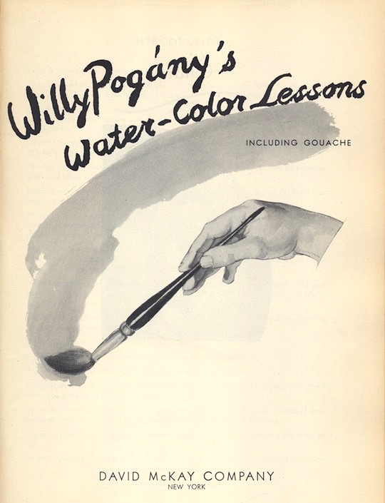
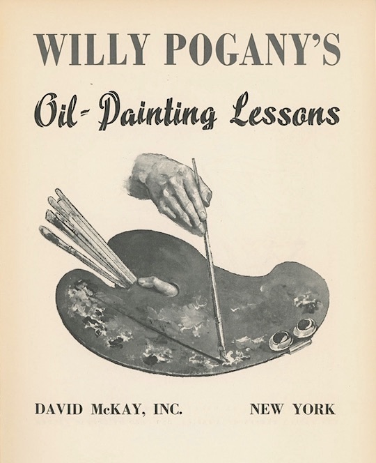
Willy Pogany (1882-1955) was a prolific illustrator of children's and other books, often in an Art Novuveau style. He is perhaps best known for his pen and ink drawings of myths and fables. Born in Hungary, he eventually emigrated to the US but not until he had studied and traveled abroad, including stays in London and Paris. I remember his excellent children's illustrations quite well, but I also borrowed the above art instruction books (title pages shown only) from my local library on several occasions, hoping his simple, sensible approach to drawing and painting would eventually rub off on me. And even though his books had some very nice female nudes that was never a factor in my borrowing decisions. Honest!
Willy Pogany's Drawing Lessons (David McKay, NY, 1946)
.
Willy Pogany's Water-Color Lessons (David McKay, NY, 1950).
Willy Pogany's Oil Painting Lessons (David McKay, NY, 1954).
Cecil G. Trew was a pseudonym of sorts for British born Cecil Gwendolen St Leger Russel (1997-1958), familiarly known as "Gwen". In 1929 she illustrated the Reveries of Omar Khayyam, and the Rubaiyat, before embarking on a career writing and illustrating children's, horse, dog, fish and art instructional books. She also illustrated an edition of The Fruit Stoners by Algernon Blackwood. I don't believe I came across either of the above art instructional books in my public library browsing but that would make sense, both were published exclusively in the UK.
Hints for Artists (Adam & Charles Black, 1944).
Questions Answered On How To Draw (Jordan & Sons, 1950).
How to Draw What You See was published by Watson Guptill of New
York in 1972, and it has been reprinted several times since. The jacket
art, text, and all interior illustrations were produced by Rudy de Reyna. De Reyna was born in Spain and educated there, as well as in England,
Mexico, and the United States. He began his career by producing movie
posters and displays for Hollywood studios. After that he moved to
Westport, Connecticut to teach fine art at the Famous Artists School.
Eventually he settled in Sandwich, Massachusetts, where he
continued to produce both fine art and commercial art, and devise
additional instructional books for art students.
'Everyone
wishes that he could faithfully reproduce the world around him--wishes
that he could draw what he sees. Here is a book that teaches you how.
Rudy de Reyna believes that there are only four basic shapes in
nature--the cube, the cylinder, the cone, and the sphere. Every object
is based on one of these geometric shapes, although the shape itself may
be greatly modified. Once you can see the basic shape of an object, you
can draw that object no matter how much detail it may contain.
The author devotes Part One of his book to the fundamentals of drawing.
In clear, concise, and lavishly illustrated projects--which the reader
is encouraged to try out for himself--de Reyna presents the basic
structure of objects, eye level, perspective, and putting basic forms to
gether. The projects in Part one are arranged so that each one is
slightly more complex than the one before, and deal with such drawing
principles as the horizon plane, light and shade, translating local
color to black and white, drawing with charcoal, drawing a still life,
drawing outdoors, drawing the figure, and drawing children.
In
Part Two, the author explains the use of media not usually described in a
book on drawing. The reader learns how to "draw" in painting media like
wash (transparent watercolor), opaque watercolor, and acrylic, which
are used here only in their black and white forms. De Reyna discusses
each medium--wash, opaque, and acrylic--separately and carefully details
the materials needed for working in each one. He presents the basic
techniques of each medium and provides exercises to help the student
gain proficiency in handling them. Then, in detailed step-by-step
demonstrations the author renders still lifes, landscapes, and portraits
in each medium, putting into practice all the techniques that he has
described.
The author also explains the use of ink for rendering
landscapes. He shows how interesting effects can be created by using
several different media in one drawing. And de Reyna stresses the
importance of choosing the most suitable medium.
Throughout the
projects, de Reyna shares with the reader his many interesting
experiences as an artist and teacher. The author's illustrations appear
on virtually every page. 176 pages. 7x10. Over 200 b&w
illustrations. Index.'

A Day in the Life was edited by Gardner Dozois and published in paperback by Perennial in 1973. The cover art was produced by
Roger Zimmerman.
Zimmerman was a graphic designer and collage artist, who worked
primarily for Doubleday producing jacket art on their science fiction
and fantasy hardback lineup between 1962 and 1982. Other than that not
much can be said about him. Doziois, on the other hand, is, or rather
was (he died in 2018), well known in the SFF world as an editor, author,
and popular convention goer and guest. In preparation for this post I
recently read at the website
Black-Gate an interesting article about SFF anthology editing. Here's what Dozois had to say about the above book:
"My very first book actually was an anthology, a reprint anthology called A DAY IN THE LIFE,
all the way back in 1970. Even today, it’s almost unheard of for an
unknown new writer to be able to sell an anthology, particularly a
prestigious hardcover anthology. I managed it, I think, because of the
slush-reading work I was doing, which was getting good word-of-mouth in
the tight little SF publishing world of the time, because of the cachet
of being a “hot new writer,” and because of some of the social contacts
I’d made. Victoria Schochet, for instance, I knew socially, from parties and
conventions, and she’d just taken over as the new editor of the SF line
at Harper & Row, and, in keeping with the revolutionary nature of
the times, wanted new and exciting kinds of books to revolutionize and
perhaps radicalize her line. I proposed a Hot New Anthology to her, and,
since I was a Hot New Writer, and so theoretically tapped into the
Zeitgeist, she bought it. A DAY IN THE LIFE has been out of print for decades, but it is now available for reading again, as an ebook from Baen."
Contents:
Introduction (1972) - essay by Gardner Dozois.
Slow Tuesday Night (1965) - short story by R. A. Lafferty.
The Lady Margaret (1966) - novelette by Keith Roberts.
Mary (1964) - novelette by Damon Knight.
Driftglass (1967) - short story by Samuel R. Delany.
A Happy Day in 2381 (1970) - short story by Robert Silverberg.
This Moment of the Storm (1966) - novelette by Roger Zelazny.
The Haunted Future (1959) - novelette by Fritz Leiber.
On the Storm Planet (1965) - novella by Cordwainer Smith.
Unfinished Portrait was written by Agatha Christie and published under her pseudonym Mary Westmacott. This paperback edition from Dell was issued in 1977, and the cover art was produced by William Teason. Teason created scores of cover art for Christie's murder mysteries beginning in the early 1960s and stretching into the 1980s. Unfinished Portrait is more of a gothic flavored romance as opposed to the author's usual murder whodunnits, hence the pseudonym.
'
She was lovely and alone, a stranger on an exotic island. Men who saw her from afar were irresistibly attracted by her beauty. Those who came closer were chilled at the terror in her eyes. What perilous past had led her here? What sinister spectre haunted her still? What fearful fate did she offer any man who fell in love with her? Inexorably, the truth in all its horror began to emerge...'
One Man Show by Michael Innes (aka J. I. M. Stewart) was published in paperback by Perennial in 1983. Irving Freeman produced the cover art. Freeman is a graphic designer and illustrator who produced scores of book and magazine covers and advertising art in the late 20th century for clients such as Harper Collins, William Morrow, Perennial, Simon & Schuster, Pfizer, Major League Baseball, NBC-TV, New York Times and New York Magazine, among others. He studied under Arthur Foster, the son of the great Hal Foster, at the Art Students League in New York City, and also at Ruskin School of Art in Oxford, England, and the School of Visual Arts in NYC.
'Sir John Appleby of Scotland Yard is unwittingly swept up into an imbroglio with the smart set when he attends a private gallery opening with his wife and in an astonishing course of events deals with paintings stolen from an aristocrat's mansion, a mad chase, and of course, the inevitable murder.'
"ONE MAN SHOW begins with a stunning description of a lecture by Mervyn Twist, the art critic, to a group of people in the gallery where the show opening takes place. The account of the facial expressions of the listeners is a marvel, and the ensuing events live up to this flourish of virtuosity... Innes' undoubted masterpiece." --- Jacques Barzun & Wendell Hertig Taylor, A Catalogue of Crime.
A Banner for Pegasus by John and Emery Bonett was published in paperback by Perennial in 1982. Anthony Boucher called the mystery novel "A pure joy." The Bonett's were a husband and wife team who wrote and published several mystery, suspense and detective novels. They also wrote, both jointly and separately, scripts for radio, television and movies, short stories and song lyrics.
The book's cover artist is Jon Wieman. Weiman has been a professional graphic designer and illustrator since 1978, producing book and magazine covers, as well as posters, advertising work and web pages. His company is WEIMAN DESIGN, and it is located in pastoral Randolph, New Jersey.
'A fractious and intrigue-ridden set of London film people invade the sleepy English village of Steeple Tottering. While on location, a murder occurs which sets star against star, members of the film crew against each other, and the whole contingent against the local inhabitants. Action, temperament and romance flourish, on screen and off, as the story builds to a splendid denouement.'
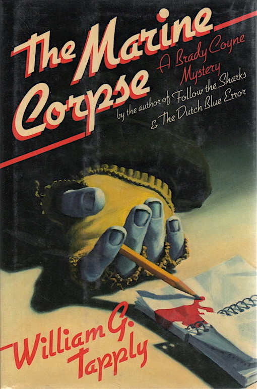
Tim Gaydos produced the jacket art on William G. Tapply's mystery novel The Marine Corpse (Scribners, 1986). I believe it was done in pastel, because that's what the award winning artist Gaydos is best at, or recognized for anyway. As for Tapply, well my wife has read all of his novels, and insists I should too. I like to start with this one because I do like the cover a lot.
'
It's a routine case for the Boston police: another drunken bum frozen to death on a wintry night. But the bum is really wealthy heir Stu Carver, masquerading as one of the homeless to gather material for a book--until he is brutally murdered with an ice pick in the ear. Was it simply a random act of violence, or has someone penetrated Stu's disguise and found something worth murdering for? Stu's uncle hires former agent, lawyer Brady Coyne, to find out. Brady's search begins with the people who knew Stu best--or who thought they did. There's Altoona, the cultured, genteel street person who became Stu's last and only contact with the civilized world. And Heather, Stu's bitter roommate, who kept the secret he couldn't share with his own family. And David, the shy prep-school teacher who helped Stu lead a very private double life. As Brady stalks a wily killer who strikes again and again, he delves into the past of a lonely man whose abbreviated life belied all appearances--and stumbles onto a truth that almost costs him his life.'
Still Life by Sheri S. Tepper is a supernatural thriller that was published in the UK by Corgi in 1989. The cover art was produced by Stephen Bradbury. When I saw this copy in a local used bookstore I didn't hesitate do grab it because I've been trying to gather as many of Tepper's SF and Fantasy novels as I can after discovering the author through her excellent pseudonymous mysteries. She wrote 13 of those under the pen-names A. J. Orde and B. J. Oliphant.
'
From the first time Sarah Chenowith sees Madelaine loitering in the neighborhood, she is convinced that the mysterious woman is evil. Then her next-door neighbor, Mr Barber, hires the darkly beautiful woman to give his wife art lessons. Soon Madelaine moves into the spare bedroom--and the accidental deaths begin. Now Sarah herself is in danger--a danger that begins the day she discovers a painting that foretells the next gruesome death. Only Sarah, who is part Hopi Indian, can stop the supernatural killer. But first she must learn to use the long-lost powers of her ancestors in a magical showdown with a most unexpected source of evil.'
Stories by O' Henry was published in paperback by Tor Classics in 1989. It contains 23 stories, with an introduction and foreword by Justin Leiber, the son of SFF author Fritz Leiber. The cover artist is unknown.
'Tales of laughter and tears, love and loss...
Tales of old and young, rich and poor, the best and the worst...
Tales of lies and truth, selfishness and sacrifice, loyalty and betrayal...
O'Henry's
stories are set in mansions and slums, teeming cities and desolate
frontiers. Stories of grand adventure, thrilling romance, gripping
suspense, hilarious comedy. Stories about turns of fate, twists of
destiny, accidents of chance...and always. always, endless surprises!
The tales of O'Henry--stories as surprising... as life itself.'
I like that the hand on this cover is holding a knife and not a brush, a subtle hint to any would-be reader that this is a murder mystery and not a romance, which Canadian born and resident Joan Smith is of course more noted for, having published dozens of them since the early 1970s. The cover art though is unfortunately uncredited. A Brush With Death was published in paperback by Jove in 1990.
'Cassie Newton craves luxury, intrigue, and romance--in other words, a life with the gorgeous investigator, John Weiss. John is in Montreal to find ten fake Van Gogh paintings that are part of a multimillion-dollar art scam. And Cassie's hope that "the couple that sleuths together, stays together" is about to become a terrifying reality. A painter with forgery in his heart soon turns up with a knife in his back, and cassie and John are in danger from someone with a sinister talent in the art... of murder. Is the cold-blooded collector who'd murder for a "Sunflower" the suave sheikh in a nearby suite... or the handsome museum curator with bedroom eyes? And will Cassie be drawn into an elegant world of illusion and deceit only to find that art, love, and money are irresistible... and deadly?'
Before Gary Ruddell drifted off into the world of fine art painting, he was one of the best cover illustrators in book publishing. Remember the jacket art on Dan Simmon's Hyperion trilogy? Yup, his. Remember Janet Morris's Tempus? Yup, also his, and stunning too! Ruddell produced dozens upon dozens of great covers for hardbacks and paperbacks starting as far back as 1981--but with time comes inevitable change, and Ruddell now focuses entirely on figurative fine art painting.
Galatea in 2-D was published by Baen in 1993. The book's blurb describes a kind of traditional fantasy motif with an artistical contemporary twist. The potential for this story seems huge to me, and I need to track down a copy to see if it really holds up. The author, Aaron Allston, sadly, left the world all too soon at the age of 53 in 2014, but he did leave us with left quite a legacy: Star Wars Universe novels, standalone novels, game designing and development, gaming magazine editing and writing, and even film directing. I may be mistaken, but I believe he was on a Star Wars panel at the Denver Comic-Con in 2013, a panel that also featured a few of my library colleagues. It was the best panel of the ones I sat through that year, in part because of Allston's contribution.
'
DA VINCI NEVER HAD DAYS LIKE THIS... Illustrator Roger Simons always thought that art should imitate life--until the day his painting came to life and propelled him into danger. On one fateful day he learns three things that change his life: that he can pull living beings from his paintings; that someone else has had the same power for quite some time; and that this person won't tolerate rivals and now wants Roger dead. Accompanied by the magical nymph Elsie, Roger must learn to use his new abilities, and to cope with the changes they bring, if he's to survive the attacks of a far more experienced and ruthless enemy. The result is a modern-day battle between wizards whose power is limited only by their imaginations... and their art supplies.'

This charming illustration, an oil on canvas approximately 28" X 19" in size, was produced by Birney Lettick. Lettick attended Yale University Art School, where, along with being taught the basic fundamentals of a classic art education, he learned anatomy by actually dissecting cadavers (ew!). Lettick was primarily a commercial artist and art teacher for most of his life, working in advertising and publishing where he graced many a popular magazine and bestselling book. His satiric covers for The National Lampoon have become the stuff of legend. He was also one heckuva movie poster artist, and some of the biggest grossing films of the 1970's and 80's can at least in some part be attributed to his deft hand.

Although the hand on the jacket art of This Is Automation (Viking, 1964) by Carl S. Hirsch is not holding a pencil, pen or brush I wanted
to include it as the final image of this article because I felt it represented the 21st century digital age we are now living in, where with almost a single push of a button someone can literally create digital works of art and illustration, works that in some AI cases are able to practically mimic the style of real artists,
anyone from Leonardo da Vinci to the actual illustrator of this book, Anthony Ravielli. It's sad really if you think about it. On your next trip to Barnes & Noble pay particular attention to the fiction section. Seemingly eighty percent of the covers have been digitally produced, some, I suspect, with the use of AI. It doesn't leave much space for traditional artists to compete in. Even the last bastion for real illustration, SFF, is slowly succumbing to the onslaught of computer generated graphic effects. So what can we do about it? Well, not much that I know of, unless you want to write to your favorite author and lodge a complaint about their most recent blasé digital cover. Fat good it will do you because even if the author did care they rarely have a say in how their books are packaged. But there is another thing we can do, and that is to support used bookshops, and buy and collect and preserve 20th century hardbacks and paperbacks that have been enhanced by real, old fashioned illustrations. Oh--and if there is a 20th century cover artist who's still alive and whose work you really like (or even a 21st century artist like Robin Lauersdorf) well go out and buy an original piece or print from them. It'll make their day and it'll look great on your wall.
* * * * *
[© February, 2024, Jeffersen]


.TheSinfulOnes.Nightstand.HaroldMccauley.a..jpg)


.UnfinishedPortrait.Dell.WilliamTeason.a.jc..jpeg)


No comments:
Post a Comment