

CAGE A MAN was my introduction to artist Franco Accornero. F. M. Busby's science fiction novel was published in paperback in 1974 by Signet. The cover art was merely initialed "FMA," and that threw me. I couldn't think of any illustrators who used those letters. Much later of course I was able to link FMA with the signature "Franco," and then eventually a full name: Franco (Francesco Maria) Accornero.
Romance fans were probably the first to become familiar with the name "Franco." It was etched on scores of attractive, sexy covers, beginning in the 1980s and continuing throughout the 1990s. Accornero didn't stop there either like so many of his peers did when digital washed over the publishing industry in the late 1990's like a tsunami, he quickly transitioned and kept on producing covers right up until his passing in the year 2020 at the age of 82.
Accornero was born in Italy in 1938. Like all good Italian sons he had intended to follow in his father's footsteps as an electrical engineer, and for nearly a decade he did just that, securing a degree and working for the Ministry of Transportation in Rome. But his one true passion was art, so after quitting his job and emigrating to the United States, he enrolled in the Art Students League in Manhattan and then later at the Visual Art Institute in New York. After that of course he began producing book covers, lots and lots of book covers, freelancing for all the major publishing houses in the US and Canada. And while we mostly think of Accornero as a romance illustrator he has in fact produced cover art for nearly every genre there is, representing authors as varied as Jeffrey Archer, Beryl Bainbridge, Robert Bloch, Dee Brown, Pat Conroy, Jack Higgins, M. M. Kaye, Dean Koontz, Stephen King, Louis L'Amour, Fritz Leiber, Anton Myrer, Ramona Stewart, Neal Travis and Irving Wallace, among many others.
Cage A Man by F. M. Busby (Signet, 1974). "I will not be caged!" Four gray walls, floor and ceiling--this had become his universe. This and the Demu. Silent watchers, prodding and pushing; tyrannical teachers, chaining one's mind. "I will not be tamed!" his mind cried out. And Barton began to will his way to escape. For he had a world to protect and a great vengeance to take. But the Demu were a most powerful enemy. And if Barton failed, the Demu would make Earth pay the price...'


The Possession of Tracy Corbin by Dorothy Daniels (Warner Paperback Library Gothic, 1973). 'A group of classmates are invited to a reunion in a deserted ghost town. The highlight of the gathering is to be a seance, conducted by a medium, in the house where, many years before, two men were murdered. During the spiritualist meeting, unearthly forces are inadvertently unleashed. Terrified, the classmates flee. But these supernatural spirits have chosen lovely Tracy Corbin as the human messenger of their evil designs. Trapped, she struggles to regain possession of her captured soul as destructive occult powers swirl around her...'
The Prisoner of Malville Hall by Dorothy Daniels (Warner Paperback Library Gothic, 1973). 'Cassie Anders is a college student, whose major interest is telepathy and psychic research. A sensitive, she is adept at card and mind reading. A friend begs her to come to his parents' country home, which is haunted by an elderly couple who were murdered there many years ago. Innocently, Cassie accepts the invitation, eager to put her psychic powers to a real test. Once inside Malville Hall she is stunned to discover that she is unable to leave. Supernatural forces intend to keep her their prisoner until she performs a special penance--communication with the dead!'
The Masks of Thespis by Mozelle Richardson (Warner Paperback Library Gothic, 1973). 'Former child star Dorit Paige returns to Futura Studios, the scene of her fabulous success, after a self-imposed exile of twenty years. She has changed and so has the studio. It was once a beehive of activity. Now it is a decrepit ruin. The sets are gutted and the props are up for auction. Dorit encounters some old familiar faces during her visit and one beautiful new one, belonging to TV star Lesley Claude. Moments after their meeting Lesley is murdered. The studio is suddenly clouded in terror, as it becomes apparent that this murder is only the beginning...'


Ten Tomorrows, edited by Roger Elwood (Fawcett Gold Medal 1973). 'Here is a collection of ten top science-fiction thrillers never before seen in print! You'll read... Barry Malzberg's YAHRZEIT--a strange story of an overcrowded world and its macabre solution to population growth. Gardner Dozois' IN A CROOKED YEAR--a chilling tale of one man who survives a cataclysmic world war only to find that he cannot live... with himself. Anne McCaffrey's THE RESCUED GIRLS OF REFUGEE--a curious story of women, conditioned from birth never to think of sex with men, who finally realize what they have been missing. Lawrence Janifer's A FEW MINUTES--a terrifying story of a man who invents a time machine to try to correct a mistake in his past, but instead destroys his own future. These stories and six more await you in TEN TOMORROWS--a classic anthology of science-fiction adventure and a startling journey into the fourth dimension we call the Future.'
Wondermakers 2, edited by Robert Hoskins (Fawcett Premier, 1974). 'WONDERMAKERS 2 offers a broad view of science fiction's development over the past two decades. The twenty stories included here are representative of the work of writers who are shaping the science fiction of today and tomorrow. Perhaps in the shape of these new and original ideas of today we can determine something of the true shape of tomorrow.'


The Enquiries of Doctor Eszterhazy by Avram Davidson (Warner, 1975). 'Discover now The Triune Monarchy invented by Avram Davidson where the supernatural, the paranormal, the quaint, the witty, the bizarre are explored by the learned scientist with five degrees--Eszterhazy.'
The Star Kings by Edmond Hamilton (Warner, 1975). 'Flung across space and time by the sorcery of super-science, John Gordon exchanges bodies with Zarth arn, Prince of the Mid-Galactic Empire 2000 centuries in the future! Suddenly John is thrust into a last-ditch battle between the democratic Empire World and the tyranny of the Black Cloud regime. Only one weapon--the terrifying Disruptor--can win the struggle for the Empire Forces. But it is so powerful that unless John uses it correctly it could destroy not only the enemy but the cosmos. Can his 20th Century mind cope with the technology of 200,000 years from now?'
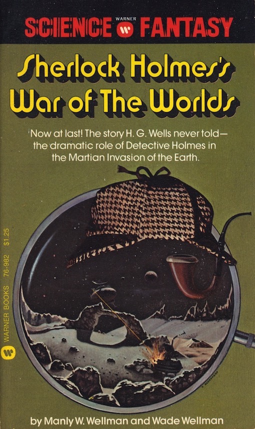
Sherlock Holmes's War Of The Worlds by Manly Wade Wellman & Wade Wellman (Warner, 1975). 'The War of the Worlds... so terrifying, it rocked the world when H.G. Wells reported it in 1897--and again, in 1938, when Orson Welles broadcast it. But there was far more to the story than ever was told. Two of Sir Arthur Conan Doyle's most famous characters, Sherlock Holmes and Professor Challenger, played pivotal roles in the historic happenings. Here are the facts, never before revealed, of the confrontation: two of the most remarkable intellects the Earth ever produced pitted against beings intelligent enough to conquer space. Read now-- how Holmes and Challenger knew an invasion was coming; how they survived the occupation of London; how they captured an alien invader; how they deduced the origin of the invaders; the reason for the landings--and the fatal flaw in the plan for conquest.'
.YolandaTheGirlFromErosphere.Grove.FrancoAccornero.a..jpeg)
The Girl from Erosphere by Dominique Verseau aka Jimmy Guieu (Grove, 1975). 'Torgar, the finest astroship devised by man, is forging its way toward the star Capella, more than forty-two light years away. On board the ship is the most sensuous quartet of cosmonauts in the annals of science: Yolanda Hammerlove [ya gotta love that name!], the beautiful sexologist; Jany Jenkins, the red-headed psychologist; Ted Cunningham, the wiry astrophysicist; and Bob Fowland, the attractive pilot. What happens when they are joined by two natives of Zolnar--supreme lovers of the flesh and connoisseurs of the erotic arts--in the first extraterrestrial contact of the races turns the odyssey of the Torgar into an orgiastic delirium of the senses. Here is the first in a science fiction adventure series exploring voluptuous delights of intergalactic love in an unblushing mixture of fantasy and eroticism for the adult reader.'

Franco produced this moody cover for Stephen King's suspense novel Rage in 1977. It was published in paperback by Signet under Stephen King's then, and so far, only pseudonym, Richard Bachman. Franco's initials are located on the lower end of the spine, as his illustration wraps around it while completing itself.
Rage was reprinted just once in an omnibus edition in 1985, and has since been allowed by King to fall out-of-print in the US. Why? Because the novel describes a school shooting, and has been associated with actual high school shooting incidents in both the 1980s and 1990s. King eventually explained in greater detail his reasons for its suppression in the most potent way any writer can, by publishing a non-fiction, anti-violence essay titled, "Guns" (all profits from its sales have and will continue to benefit the 'Brady Campaign to Prevent Gun Violence'). Sadly, but necessarily, it was written in the aftermath of the horrific 2012 Sandy Hook Elementary School shooting.
Currently on ebay there are several copies of Rage listed for sale. The prices range from $2K to $15K for a signed copy (and when exactly did King sign that book that he supposedly has misgivings about?). Wow! Talk about greed-flation! Are all of its sellers republicans? I mean let's face it; rub' CEO's are the architects behind all greed-flation since the pandemic (and before it too)--it's certainly not egg-sucking liberal dem' CEO's, as if there are any. But I do understand that of the several thousand copies of Rage that were initially
published in 1977 only so many can still exist today, at least ones that are worth collecting, but jeez Luigi, does that really constitute it as being the holy grail of paperbacks? Well yes, maybe it does.
'The sly voices in his mind whispered their terrible warnings, telling Charlie exactly what he had to do... And one by one the students filed into the room, laughing, talking, never suspecting that today's class would be like no other. For today Charlie would lead them in his savagely dangerous game of Show and Tell--and all their secrets would explode into a nightmare of violence and terror... RAGE, a powerfully charged novel that explores the darker ranges of the mind, and the horror of sadistic manipulation.'


A Woman in Silk and Shadows by Dorothy Daniels (Signet, 1977). 'It was sorrow that brought young Cora Taylor home from Europe--sorrow and her promise to see Aunt Maggie buried in the little cemetery on their family's island. But in spite of all her troubles, the loss of her aunt so soon after the deaths of her own parents, Cora was glad to be home to see Joel again. Handsome lawyer Joel Lansing was only too happy to take over the management of all Cora's affairs, while making it plain that he felt much more than a business interest in her. It was Joel whom Cora told about the ghostly presence in the old house and the near brushes with death she had experienced since her return home. Joel swore he'd protect her from the evil force that seemed determined to claim the last of the Taylors, But even he couldn't be with Cora all the time, and ever so slowly the island trap began to close about her till it seemed there was no escaping the terrible destiny which had taken her family one by one...'
Hermitage Hill by Dorothy Daniels (Signet, 1978). 'The deserted inn once belonged to her father and now belonged to her. As she wandered through the halls of Hermitage Hill, beautiful Laura Ashton couldn't help recalling how he had died. No one ever found the body, but Laura herself heard the explosion and saw the ship sink off this very coast. Then why was a detective now claiming that her father was living in France off the jewels and money that had been stored in the ship's safe? Laura knew it was a lie. She had returned to Hermitage Hill to prove it, and with the aid of handsome attorney Jim Cronin she was sure she would find the truth. But danger waited for those who would disturb long-buried secrets--danger that could destroy both Laura and the man she had grown to love...'

 |
| CLICK ON IMAGE TO ENLARGE |
'The ambitious Turvilles remembered little Eugenia as a plump, vulgar, provincial girl--but she had come into a fortune and it was up to Frank or Aubrey to woo and win her. Mischievous, canny, grown into an extraordinary beauty at 16, Eugenia fathomed their scheme and determined not to disappoint them. She had plans of her own. She would choose her own man... a man like Sir Peter Martyn. But when sophisticated, widowed Lucilla arrived from Regency London to reclaim Peter for herself, and Frank penetrated Eugenia's disguise to find he truly cared, her clever ruse threatened to backfire, costing her the only love that could bring her happiness.'

When No One Is Looking by Madeline Tabler (Tempo, 1978). 'That night at the dance was a rude awakening for Sara Troy when a boy said a horrible thing to her about her mother. Finally she had to face the fact her father didn't love her and her mother was little better than a tramp. But Kevin was there in her moment of deepest despair to cheer her and guide her from the mess her life had become. Kevin too was fleeing from the lies and hypocrisies of the adult world. Theirs would be a crusade of truth. But their crusade got off to a bad start when they missed the kids traveling to California. The grubby apartment they took on an alley at the beach was heaven until they went to the party at the "Dorm" and Sara found herself drinking and popping pills and doing all the things for which she'd condemned her parents.'


'The Fire Ants have no natural enemies. The Fire Ants attack people and animals with a deadly sting. The Fire Ants have drawn the good people of Scottville into a lethal battle--against each other: Callie Ricketts--a girl in love, until death paid her for her sins; Reverand Luke Coxey--a zealot who inspires his congregation with hate and fear; Billy Joe Wyatt--a political hustler with a fatal mean streak; Deputy Sam Henley--he only knows that unless his people work together he won't have any citizens left to protect...'
 |
| CLICK ON IMAGE TO ENLARGE |


Zebra was a relatively new paperback house in 1978 and 1979, having began operations just four years earlier. Dozens of cover artists took advantage of it too, chief among them Franco.
Dracula's Guest by Bram Stoker (Zebra, 1978, cover proof). 'The ultimate in horror, from the blood-curdling imagination that created DRACULA, is here for the first time in paperback! Plus--an unpublished werewolf episode from the novel DRACULA which was found among Stoker's papers and added to this volume by his widow.'
The Jewel of the Seven Stars by Bram Stoker (Zebra, 1979). 'What strange thread of blood binds young Margaret Trelawny to the mummy of a beautiful Egyptian Queen dead more than 5,000 years? Why do the two men who love her now fear for her very life? Another chilling tale of mystery and horror from the author of DRACULA.'
The Lair of the White Worm by Bram Stoker (Zebra, 1979). 'Deep beneath the old house of Diana's Grove a primeval creature waits patiently to complete its ancient task of destruction--a creature that achieves its deadly aims in the human guise of a woman... She tore off her clothes with feverish fingers, and in full enjoyment of her natural freedom, stretched her slim figure in animal delight. Then she lay down on the sofa--to await her victim! Edgar Caswell's life blood would more than satisfy her for some time to come.'


The Beach Club by Claire Howard (Warner, 1980). 'Have fun in the sun with... LAURIE: The smouldering redhead whose husband is down from the city only on weekends. She's sexy and bitchy by then--and anxious--when he brings along a teenage baby sitter bursting out of her bikini and out of bounds. B.J.: The stunning, sharp-tongued rich girl who trapped her husband into marriage and herself into a swinging scene--taking on whomever he chooses, whenever he chooses. SANDY: The loving wife whose husband has so much love in him it just overflows--to other women. JAN: The plain girl whose husband lost interest in her as soon as her father took him into the business, the loser who has found herself at last--in a steamy cabana with the steamy man who runs the club.'
Cable Harbor by Donald Bowie (Avon, 1982). 'They were rich, they were bored, they were restless. Marie was drinking her divorce away. Laura was trying to forget that she had just been fired from a Manhattan publishing firm. Jamie Lawrence, too young and beautiful to be alive, was living in a tent on his grandmother's estate. Herbert and Arthur were on the verge of losing their reputation as the Harbor's happiest couple. Dan had just discovered a dead female hitchhiker in his uninhabited mansion... And that fun was just the beginning. How did Marie set fire to the bedroom during the party? And what was she doing in the bedroom anyway? How did Vivien get herself bitten by a half-rabid bat? Why did Arthur leave Maine to spend all that time in the West Village? What did Jamie do to Laura to maker her cry so much...?'

Khai of Ancient Khem by Brian Lumley (Berkley, 1981). 'All bowed their heads before the golden splendor of the pyramid of Khasathut. Slaves and princes alike feared his awesome powers, which came from far beyond the stars... But Khai was not blinded by the glories of the Pharaoh. For not only had he seen the horrible secrets of the pyramid--he had lived to escape their deadly grasp. Through a quest of forty lifetimes--from ancient Khem to modern London--Khai had fought to win the hand of the Queen Ashtarta, and to vanquish the devil-king and his wraiths of hell. And he had kept to an eternal faith: that one day the Golden Ones would return from their journey through the heavens, and bring justice...'

 |
| CLICK ON IMAGE TO ENLARGE |
Phoenix Legacy 1, Sword of the Lamb by M. K. Wren (Berkley, 1981). 'The House of Dekoven Woolf: ALEXAND--the eldest, heir to a great industrial dynasty, and also its prisoner, his destiny and his heart forever at war... ADRIEN--his beloved, rebelling against the law that a woman born to rule cannot give herself to love... RICH--gentlest of the House of Woolf yet feared as the "Lamb," leader of THE PHOENIX and sworn enemy of the most dazzling empire humankind has ever known...'
Phoenix Legacy 2, Shadow of the Swan by M. K. Wren (Berkley, 1981). 'The magnificent saga of a great family's role in the fall and rebirth of man: DR. ERICA RADEK--chief psychoscientist and founding member of THE PHOENIX, she had the mind of a computer and the heart of a woman... DR. ANDREAS RIIS--the frail, elderly genius whose inventions could take Man beyond the stars--if his enemies let him live! COMMANDER ALEX RANSOM--he had abandoned ConFleet's pinnacles of power in the hope of saving Man's crumbling empire. He may have been too late...'
Phoenix Legacy 3, House of the Wolf by M. K. Wren (Berkley, 1981). 'The triumphant conclusion to the magnificent saga of an empire that spans the stars: JAEL--the son of a thief, he became the servant of the highest destiny of all... LADY ADRIEN ELISEER--a woman of fragile beauty and tragic legacy, she hid behind a veil of secrets and carried the burden of an unspeakable dream... COMMANDER ALEX RANSOM--in a universe torn asunder, he was a leader of strength and vision. And a target his enemies could not afford to miss...'

 |
| CLICK ON IMAGES TO ENLARGE |
The Books of Rachel by Joel Gross (Signet, 1981). 'In each generation there was a RACHEL... RACHEL, who suffered a woman's greatest humiliation and vowed a most terrible vengeance... RACHEL, who was tempted out of the safety of the ghetto and into a world of sensual splendor and cruel corruption... RACHEL, who abandoned a position of power and privilege for a lover who had only his greatness to offer... RACHEL, who followed a glorious dream into a savage wasteland of Mid-Eastern intrigue and violence... RACHEL, who was led by desire and destiny from the haven of aristocratic England to the inferno of Nazi Germany... RACHEL, whose unbowed young shoulders had to bear the weight of the centuries... Each of them came from the same fiercely proud family, and each was heiress to the flawless 60-carat diamond that symbolized their lasting imdomitability...'
The Lives of Rachel by Joel Gross (Signet, 1985). 'In the spirit of its bestselling predecessor, The Books of Rachel, this enthralling saga plunges even further back in history to trace the heritage that links another five remarkable women... RACHEL OF JUDEA, who defied a half-mad and lustful king to save her husband's life... RACHEL OF ROME, who rose up from slavery to take just revenge against her corrupt master... RACHEL OF BYZANTIUM, a miraculous healer who risked death to help stop the spreading horror of the plague... RACHEL OF LONDON, who played a crucial part in the destiny of Arthurian England... and RACHEL OF MAINZ, who cleverly escaped a Rhineland pogrom... They shared a name and a priceless inheritance--the will to survive against all odds... '

Charlie's Daughter by Susan Child (Signet, 1982). 'Charles Swann was a self-made multimillionaire, a man driven by insatiable ambition and the overwhelming need to be accepted by Boston's elite society. Anne, a young Irish beauty brimming with life, was his perfect mate in passion, loving him with all her soul in a way his cool, upper-crust wife never could. They cherished their forbidden moments of happiness together, for Anne could never find a place in Charlie's world and he couldn't bring himself to sacrifice everything he had fought so hard to attain--not even for the woman he loved. And then Anne gave Charlie the one gift no one else could--their beautiful child, Kate, who would one day have to pass final judgment on the stolen love that had brought her into being.'

I can't think of one paperback artist who didn't succumb to the lure of producing illustrations for men's adult adventure genre series books. It was like some kind of mojo calling that no one could escape from. It truth though it was just another opportunity to get paid. But it had to have been fun for everyone involved, artists/photographers and models alike. Also, on a side note: It was in the early 1980s that Accornero dropped his initials FMA in favor of using "Franco," a derivation of his first name, Francesco. It's not always fully visible (above on V.6, the letter F can be seen just below the palm trees), but it became his preferred mark from that point on.
Ninja Master 4, Million Dollar Massacre by Wade Barker (Warner, 1982). 'There's blood on the boardwalk at Atlantic City--gambling's back and the ganglords are loading their guns. The stakes: complete control of organized crime. The question: which godfather will be number one. Brett Wallace, Ninja Master, steals into the local underworld disguised as a hit man for hire. His aim: to stop the killing. His weapon: the deadliest martial art of them all-the art of Ninja.'
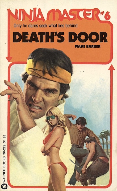
Ninja Master 6, Death's Door by Wade Barker (Warner, 1982). 'The murders are more brutal than anything in a horror movie. The killers are zombies who laugh at their own deaths. They strike out senselessly, at random. Now the beautiful Lynn McDonald has become their target, and Brett Wallace, Ninja Master, knows he has to get involved. And in order to fight them, he must find out why they are killing. The answer is even more terrifying than the murders themselves.'


Keepers of the House by Con Sellers (Pocket, 1983). 'After the Civil War, Nevada lured every brand of dreamer with the silver glitter of its Comstock Lode, the promise of new riches and adventure. Here, a gracious, polished, hardworking Lady set up a house of pleasure unrivaled in opulence and profits, built with the aid of a Southern gentleman rumored to be a Confederate spy. Lawmen and outlaws alike savored the sensual pleasures of the House of dreams. And from mother to daughter, down the years, it flourished through good times and bad--a proud and legendary legacy, where many a man bought an evening's dreams from the KEEPERS OF THE HOUSE.'

The Penthouse by Elleston Trevor (Signet, 1983). 'He made it terrifyingly clear that he would love her--forever. He was Joe Dotson, a window-washer working the posh Park Tower penthouse, when he fell instantly and obsessively in love with Tina St. Clair. And the moment he forced his way into her apartment, he vowed to blow the building clear across Manhattan if anyone dared threaten his romantic idyll... Tina St. Clair had always inhabited a world of privilege and glamour, where her slightest whim was law. Now she was a helpless captive to the whims and desires of a crazy man who held her life in the grip of his loving arms... Outside, the most brilliant of New York's police desperately tried to negotiate an escape for her. But Tina knew that only she could save herself. Yet as she steeled herself for a showdown with death, there were two things she did not calculate. The strength of her captor's passionate need to possess her utterly--and her own weakness before this overwhelming hunger...'
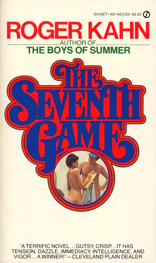

The Seventh Game by Roger Kahn (Signet, 1983). 'Johnny Longboat is a great pitcher--maybe the greatest-- a pitcher with a windmill motion who came out of Trail O'Tears, Oklahoma, and conquered New York on his way to a spot in the Hall of Fame. At forty-one, he has a mistress, a wife, an alienated son, and one more game to pitch before his career ends--the deciding seventh game of the World Series. With the eyes of millions on, Johnny thinks of his past and of the hard choices he must make for the rest of his life--a life that will no longer fit into neat nine-inning games. Before the game is over, Johnny Longboat will have to choose between two women, two futures. And he will have to find out how much strength is left in his arm--and in his soul...'
 |
| CLICK ON IMAGE TO ENLARGE |
Wrap Her In Light by Sandra Adelson (Pocket, 1983). 'She was a Princess, beautiful daughter of Pharoah Akhenaten and Nefertiti and heir to the throne of Egypt. He was a lowly scribe of the royal court, who would defy all laws of the empire to join her in a dangerous, life-long passion. Amid the flames of heresy and war that ravaged the sultry banks of the Nile, their secret love grew and bore forbidden fruit. And one day their daughter would rise to seize her birthright and bring Egypt to new glory. But for these lovers, there was only one sacred trust--a passion whose power would endure beyond all laws of man or god.'

The Mirror Image by Maggi Charles (Silhouette Special Edition, 1984). 'Tiffany was often haunted by her own reflection, an image that revealed only the shell of a woman. She had fallen in love with a young doctor, but had lost him when the pressures of his job had shattered her perfect life. Alan Winslow was a dedicated surgion who still believed in preserving life, though it seemed as though his own had ended when he lost Tiffany. When they met again after seven years apart, she was still devastated by his presence. His capable hands rekindled her passion, his feverish lips reminded her that their seven years of bad luck had ended... Together, they would portray a true image of love.'

Bittersweet Bondage by Sonya T. Pelton (Zebra 1984). 'It was Morocco, the land of sultry winds and tropical scents, where ravishing Rosette Forrest would forget the man who had broken her heart. And forget she did, when she found herself in the tantalizing embrace of mysterious, magnetic Mark Rawen. His deep green eyes promised nights of rapture as endless as the Sahara sands. Only he was a man who had many women, casting them aside once his appetite had been sated. Rosette couldn't stop herself from seeking out the pleasures he aroused but she would never again surrender her love... The handsome rogue had lost interest in all the women who offered themselves and sought his attention. He was looking for a challenge, a special intriguing beauty--he found his match in Rosette. Her long auburn hair and dusky rose lips delighted his senses and set his blood on fire. Her dark golden eyes revealed her innocence yet could not hide her passion. He was determined to treat her like all his other possessions until the moment he claimed her silken flesh--then he knew he'd always keep her in BITTERSWEET BONDAGE.'


The Hand of a Woman by Diana Brown (Signet, 1985). 'She struggled to become a doctor in a medical world ruled by men... It was a perilous plight in the 19th-century America to be a desirable young woman, alone and impoverished, with a stain on her past that had to be kept a secret. And for that same young woman to seek entry to a world of medicine barred to her sex bordered on the impossible. Demaris Fanshawe was that woman, making the ultimate personal sacrifice to become a doctor, only to have it all threatened by two men--ruthless New York financier Templeton Caylew, who could ruin her unless she yielded to his shocking proposal... and Caylew's son-in-law, handsome, gallant Southern planter Guy Parrish, who offered a love that would break her heart to refuse, and destroy her career to accept...'

Star of Peace by Jan de Hartog (Signet, 1985). 'The year is 1939. The ship, Star of Peace, sets sail from Europe. Her cargo is 250 Jews fleeing Nazi Germany and certain death. Her Captain is a born-again Christian who has vowed to deliver them to safety. Her crew is a rag-tag collection of seamen who move ever closer to mutiny as it becomes clear that no land wants any part of them, and that only the sea hungers to claim them...'
 |
| CLICK ON IMAGE TO ENLARGE |
Until I located Franco's signature on the back cover near the edge of the spine, I pondered whether this cover art was the work of either Roger Kastel or Fred Pfeiffer, who both had a history of combining pencil with paint to create this kind of marvelous wraparound illustration. I've yet to come across another cover by Franco in this manner, but I'm always on the lookout (this also shows Franco's remarkable skill at drawing, the all important underlay of all good painters).
River of Dreams by Gay Courter (Signet, 1985). 'Beautiful Margaret Claiborne was sheltered and convent-bred when, after the Civil War, she fled the defeated South to Brazil. In this distant land that had its own rules about life and love, Margaret met and married her best friend's brother, the most powerful man in Rio. Though he adored her, blond, god-like Erik Larson harbored his dark secrets from Margaret--his exotic mistresses and his children of mixed race. As sensual and haunting as the glittering life of Rio de Janeiro it evokes, River of Dreams is the intensely emotional story of a woman's romantic quest for fulfillment... and of the two strong men who each possessed part of her, as she burned for the love of one, and was swept up in a fury of passion for the other...'

 |
| CLICK ON IMAGE TO ENLARGE |
The Snow Gods by Herbert Burkholz (Signet, 1986). 'In Europe, they were the Prinzes. In America, they were they Princes. Two branches of a driving, dynamic skiing dynasty. Loving each other. Hating each other. Fighting each other. Saving each other. Until it all came down to father and son, each a man who could not admit defeat, and both in love with the same tantalizing, sensual woman who wanted more than any one woman should. Here, in a towering global saga, are the daring and passionate men and women who played for the highest stakes and could conquer everything but their own dangerous desires...'

 |
| CLICK ON IMAGE TO ENLARGE |
Western novels were still popular in the 1980s, but their dust has settled down almost completely in this, the new techno-infested 21st century. Not that westerns were anything but glorified myth and fable in their heyday, but sometimes, in the hands of someone who could really write, like Matt Braun, they were fairly entertaining stuff. Barnes & Noble still has a small section of western paperbacks, but nearly every title that is not a Luke Short or Louis L'Amour reprint is authored by William W. Johnstone, or to be more precise, his ghost-writer--the real Johnstone having died in 2006. Ironically, that publishing situation mirrors exactly that of the late V. C. Andrews, another writer that, while labeled mediocre by many, was nevertheless unique in the annals of fiction.
The Brannocks (V.1) by Matt Braun (Signet, 1986). 'Three brothers, coming from a defeated South, heading west to build new lives in the boom town of Denver. Earl Brannock, who would gamble on anything, be it a turn of a card or a woman's smile. Virgil Brannock, lusting for wealth and power. Clint Brannock, the loner, driven by a rage that only violence could satisfy. Their women. Belle sold her body often but gave her love rarely. Monte could match her skill and nerve with any man. And Elizabeth, the beautiful, sheltered heiress, turned out to be the strongest, most sensual and adventurous of the all.'


Lost by Gary Devon (Warner, 1987). 'THE HUNTERS: A rough-cut, scrappy looking boy and a large mongrel dog. Forces full of rage, moving like wraiths upon the land. THE HUNTED: A woman and the three small children she has abducted out of a need for love, a passion to protect. Seekers for a refuge from terror and desperation on an endless flight from an unrelenting maniac. THE HUNT: For the pursuer, there is no reality but his murderous obsession for his sister. For the pursued, there can be no haven until the final searing encounter that will consume the good--or purge the evil.'

'The elevator doors open. Within seconds, four bullet-ridden bodies litter the cold concrete floor of the underground parking garage. A Vietnamese woman, a businessman, a DJ, an accountant--complete strangers, their lives obscured by shadows, their murders a frustrating puzzle for Detective Sgt. Devlin Rourke. Suddenly a witness surfaces, an eccentric woman, a nomad who can identify the killer. Rourke rushes her to secluded safety. But it is not safe enough. For the paid assassin is back on the job, and he fully intends to give his employers their money's worth. What ties the victims together? Why were they hit? What's at stake for the killer? And how long can Rourke protect Rachel? Rourke's search for the answer takes him from the drugged glitter of the rock scene to Baltimore's mean streets to Orioles stadium, rocketing him toward a climax that rivals the author's famous SIX DAYS OF THE CONDOR in nerve-shattering impact.'

Fallen Angel by Catherine Hart (Leisure, 1989). 'The nuns called her Esperanza because her sweet face and ethereal beauty brought hope to all she knew. But no one at the secluded desert convent guessed that behind her angelic smile burned a hot flame of desire. Only one man could touch that smoldering core and and fan it to life with his blazing kisses. But Jake Banner was a man of violence, not a man of God. He was a feared gunfighter, who took lives instead of saving souls. He was the stepbrother she had always adored, the lover whose forbidden embrace would send her soaring to the heavens, only to leave her a FALLEN ANGEL.'


Nobody's Fault by Nancy Holmes (Bantam, 1991). 'On a brisk April night in 1974, Lord Charles Warrington sneaks back into his fashionable London townhouse to murder his estranged wife, the Countess Amanda. Instead he bludgeons to death a young nanny by mistake, then brutally beats his wife, only to end up making love to her one last time before he flees the scene. But Amanda's ordeal isn't over. It has only begun. Now she has a terrifying choice: Either let Charles get away with impunity, or fight back against his patrician social circle as it closes ranks to protect one of its own--even if he has committed murder.'


Stony Man, Strikepoint by Don Pendleton (Gold Eagle 1994). 'With a combination of state-of-the-art technology, weapons and combat skills, the covert defense organization known as Stony Man battles the enemies of civilized man, fast and furious--no negotiations, no treaties, no diplomacy... Iraq has found the means to a perfect warhead and delivery system--buying the talent of ex-KGB scientists whose skills no longer have a place in free Russia. Mac Bolan and the Phoenix Force warriors forge a deadly strategy that includes both impersonation of a defecting scientist and a perilous quest across Europe--destination Turkey, launch site of a lightning strike into Iraq--where a single misstep along the way means disaster for the world.'

Maiden Voyage by Cynthia Bass (Bantam, 1998). 'In 1912 the Titanic was the largest, fastest, most lavish man-made object on earth--the elegant and invincible consummation of the Industrial Age. For one young boy, its ill-fated maiden voyage would be a journey of crisis and discovery. On his own for the fateful crossing, Sumner Jordan finds himself drawn to two very different passengers: the beautiful American feminist Ivy Earnshaw, and Pierce Andrews, aviator and cynic. Theirs was a destiny that would remain forever unfulfilled as, in the final moments of the doomed ship, these three young people had to face their worst fears and overcome their greatest challenge.'

Desperate Alliance by Cory Daniells (Bantam, 2002). 'In a land of enchantment and betrayal, an empress sworn to a new future must face the world she left behind... With her wine-dark eyes and silver hair, Imoshen is the last T'En Empress--blessed with exotic beauty and an extraordinary gift of healing. Once the enemy of the fierce Ghebite General Tulkhan, Imoshen surrendered herself and her island to the powerful invader to save her people. But what began as a political alliance blossomed into a passionate love, and now they share both a kingdom and a newborn son. Yet Imoshen’s past still comes back to haunt her, as the T’En renegade, Reothe, refuses to relinquish his once betrothed. Believing Tulkhan will reject Imoshen if she carries another man’s child, Reothe uses T’En trickery to seduce her; but Tulkhan’s love proves stronger. Angered and betrayed by Reothe, Imoshen still cannot bring herself to forsake her fellow T’En. For Imoshen is hungry for the ultimate intimacy--the sacred mind-touch that she can share only with Reothe. It is a longing that could jeopardize her heart--and perhaps even the future of Fair Isle.'