IN THE 1970's after every payday I routinely went to a mall and splurged on paperbacks at either B. Dalton's, Waldenbooks or Hatch's Books. It was primarily science fiction, fantasy and horror that I bought, but also thrillers, mysteries, historicals and sometimes non-fiction. Mostly though I had my brain and especially my eyes stuck in the SFF & horror section. Even back then I was just as hooked on a book's cover art as I was with its contents.
I had already started collecting paperbacks based on their covers too. So in April of 1974 I immediately took notice of The Best of Stanley Weinbaum, an interestingly designed paperback with a Dean Ellis cover illustration. The back cover stated that this was the first volume in a new series of "Best Of" single-author collections that Ballantine Books, soon to be called Del Rey, would publish over the next several years. They were labeled as "Classic Science Fiction" by Ballantine's newly appointed editor, Judy-Lynn del Rey, wife of Lester, himself a noted SF writer, who was also hired to be a co-editor at Ballantine.
The literary merit of the "Classic Science Fiction Series" (sometimes referred to as the "Classic Library of Science Fiction") has already been addressed by others (here, here and here) and addressed well, so I don't want to rehash anything that's already been gone over. My emphasis will be primarily, but not entirely, on the artists that were chosen to represent each volume. They were, and are, as classic in their own way as the author choices themselves.
Below, in order of their first printing dates are the original twenty-one titles, including their cover artist(s):
The Best of Stanley G. Weinbaum (Jun. 1974) Dean Ellis.
The Best of Fritz Leiber (Nov. 1974: two covers) Dean Ellis. Michael Herring.
The Best of Henry Kuttner (Apr. 1975) Dean Ellis.
The Best of Frederik Pohl (Jun. 1975) Dean Ellis.
The Best of Cordwainer Smith (Sep. 1975) Darrell K. Sweet.
The Best of C. L. Moore (Mar. 1976) The Brothers Hildebrandt.
The Best of John W. Campbell (Jun. 1976) H. R. Van Dongen.
The Best of C. M. Kornbluth (Jan. 1977) Dean Ellis.
The Best of Philip K. Dick (Mar. 1977) Vincent De Fate.
The Best of Fredric Brown (May 1977) H. R. Van Dongen.
The Best of Edmond Hamilton (Aug. 1977) H. R. Van Dongen.
The Best of Leigh Brackett (Sep. 1977) Boris Vallejo.
The Best of Robert Bloch (Nov. 1977) Paul Alexander.
The Best of Murray Leinster (Apr. 1978) H. R. Van Dongen.
The Best of L. Sprague de Camp (May 1978) Darrell K. Sweet.
The Best of Jack Williamson (Jun. 1978) Ralph McQuarrie.
The Best of Raymond Z. Gallun (Aug. 1978) H. R. Van Dongen.
The Best of Lester del Rey (Sep. 1978) H. R. Van Dongen.
The Best of Eric Frank Russell (Oct. 1978: two covers) H. R. Van Dongen. Barclay Shaw.
The Best of Hal Clement (Jun. 1979) H. R. Van Dongen.
The Best of James Blish (Aug. 1979) H. R. Van Dongen.
Two additional volumes were published in 1982 and 1988, bringing the total number of volumes up to twenty-three, but since their font design was completely different, they technically fall outside of the original series in my opinion. They are:
The Best of H. P. Lovecraft (Oct. 1982) Michael Whelan.
The Best of John Brunner (Nov. 1988) Barclay Shaw.
If you are wondering why this author list seems about as narrow as it is broad it's probably because Ballantine lacked the publishing rights to the stories of some of the biggest names in SF, such as Anderson, Asimov, Bester, Clarke, Heinlein and Silverberg. In truth, there are at least a dozen more authors that Ballantine should have honored in their Best Of series in order to fully round out the project, and could have if it weren't for that durned red tape, plus the fact that rival Pocket Books decided to flex its competitive muscles at about the same time (I'll be showing all fourteen volumes of the Pocket series, along with some peripheral Best Of's from other publishers, in a future post).
I bought each volume as soon as they hit the store shelves. Or I thought I did. Turns out I'm missing a few; three to be exact. Those gaps will be represented here with smaller images borrowed from elsewhere. All of the covers are shown in the same order that they were published, although they would
probably be better served if they were lumped together by artist instead. If you require a precise listing of each book's contents, please refer
to isfdb.org, the web's premier SFF (and Horror) reference database. They've got all of that and
more besides.


The Best of Stanley G. Weinbaum (Ballantine,
April, 1974). Collects 12 stories. Introduction by Isaac Asimov.
Afterword by Robert Bloch. Cover art by Dean Ellis.
The Best of Stanley G. Weinbaum (3rd printing, Del Rey, January, 1979). Note: The strip underlying the titling font on the first printing was
discontinued after the second printing, allowing for a fuller representation of Ellis' cover art. Subsequent series volumes kept pace.
After a youthful fling in the 1960's with science fiction author's
Victor Appleton, Jr., John Blaine, Edgar Rice Burroughs, Robert Heinlein, Andre Norton, Kenneth Robeson, and Edward E. 'Doc' Smith, among others, high fantasy came calling with all her sorcerous appeal. Tolkien, Eddison, Peake, Dunsany, Morris-- could I ever escape their magic? Well, sort of, but it took the illustrative strength of Dean Ellis to bring me back to science fiction so thoroughly in the 1970's. His clean, unmuddled imagery was a lure that just couldn't be ignored by a cover art nerd like me. Remember Ringworld? How about Expedition to Earth, Childhood's End, and Hospital Station? On Weinbaums Best Of, Ellis illustrates with perfect clarity a pertinent
scene from the ground-breaking 1934 alien story, "A Martian Odyssey." Note the perspectives on display: height, width and depth. And dig those long, pointed schnozes on both the Egyptian and the alien. Hilarious! Yeah, I was back in the science fiction fold. Absolutely.
'Stanley G. Weinbaum's first story, "A
Martian Odyssey", introduced Tweel---that charming and inimitable
Martian, the first in Weinbaum's menagerie of unforgettable aliens.
Weinbaum populated his universe with many delightful creatures, most of
whom are collected here for the first time in paperback. Now you can
read "A Martian Odyssey" and many of the favorite Weinbaum stories that
followed. They are as delightful today as when they first appeared.
Enter the world of Weinbaum. There's never been another like it!'


The Best of Fritz Leiber (2nd printing, Del Rey, September, 1979). Cover art by Michael Herring.
I met a writer-journalist named Gary Wells while playing in a tennis ladder, and we became friends for a while. He wrote a general interest column called "The Lamplighter" in The Douglas County Express, a short-lived journal published back in the 1980's in Castle Rock, Colorado. The two of us shared an interest in SFF and we would often swap recommendations. Being a fan of Fritz Leiber, I insisted that Wells give him a try. "Meh!" said my friend after sampling Leiber's Best Of collection. "Poul Anderson is a lot better and bolder in my opinion." Which goes to show that you can never be sure that anyone else will like what you like; after all, we each bring to the table our own individual appetites. Which leads to Dean Ellis vs Michael Herring. Ellis illustrates one of the shortest stories in the book, "The Big Trek," and Herring illustrates one of the longest, "Gonna Roll the Bones." It would seem to me that the art editors, by dropping Ellis in favor of Herring, have chosen our favorite for us. That being said, I still believe Herring, a realist painter by turns, is one of the most underrated artists in all of SFF, even though he's produced hundreds of marvelous looking covers for more than four decades now, many of which are outright classics. Look at his artwork on Baum's Oz series, or Haggard's adventure novels, or Burrough's The Land that Time Forgot and The Lost Continent. How about his stunning cover art on Evangeline Walton's Witch House? And then there's Tiptree's Warm Worlds and Otherwise, which continues to haunt me to this day. And lest we forget, his powerful artwork for James Axler's Deathlands series. Yeah, Herring's painted a few classics. Wow!
"All I ever tried to write was a good story with a good measure of strangeness in it. The supreme goddess of the universe is Mystery, and being well-entertained is the the highest joy." --- Fritz Leiber, from the afterword


I always say the problem's in the mirror, only on this cover it is also the drunk reclining on the sofa. Ellis' illustration depicts Kuttner's "The Proud Robot," first published in Astounding magazine in 1943. It's a comedic tale, and reflects a great deal upon what the author was trying to accomplish in much of his short fiction. But if, like me, you prefer things to be more serious, then be sure to read "Two-Handed Engine," or better yet, "The Big Night," which is probably Kuttner's best piece in the collection (not withstanding "Mimsy Were the Borogoves"). "Big Night" was first published in Thrilling Wonder Stories in 1947, and at the very least it is a minor classic of space opera.
"If you have arrived at this book and look to Kuttner for religious instruction, secular improvement, or moral renovation, save with certain exceptions, you had best retreat to forms of literate navel-lint plucking with which the sophomores of the world bug each other. Kuttner will not kick, bite, beat---much less hug, kiss, or improve you. And thank God for that!" --- Ray Bradbury, from the Introduction
"The author's best quality is his irreverence, which delights and scandalizes...! " --- Chicago Tribune


I recently took a drawing class on perspective and it was extremely enlightening. Now everything I draw will have adhere to the methods I learned that day and be better off for it, I hope. This cover by Ellis is a perfect example of perspective done right, and the perfect reference tool to keep within reach of my drawing table. I believe it reflects the tale, "The Midas Plague," a satirical look at robots and consumerism, but I could also be wrong; at least, I don't recall a factory assembly line with robots quite this massive in Pohl's story.
"Nothing is easy to categorize about the life and works of Frederik Pohl. His stories vary more in length, attitude, type and treatment than those of any other writer I know. About the only point of similarity is the high level of excellence to be found in everything from his short-shorts to his novels. To make things more difficult for a biographer, he has been one of the leaders in almost every activity that in any way relates to the broad field of science fiction." ---Lester Del Rey, from the Introduction
"Frederik Pohl---his field of interest is contemporary urban society and its chain of production and consumption... His mode is typically the satirical utopia, with comic-inferno elements rarely absent... His method is selective, exaggeration of observable features of our society..." --- Kingsley Amis


There were five printings of The Best of Cordwainer Smith through 1985, the most for any Best Of volume. That also tells us how popular Cordwainer Smith was back in the day. Or did Sweet's cover art actually help with sales? Probably. All of Sweet's idiosyncrasies are certainly on display here, the great and perhaps not so great (actually, in general this is one of his finest illustrations), but so is very thing he's often ignored with doing: formulating science-fiction environments. Sweet will be always be recognized as a great fantasy painter, and deservedly so, but his ability to construct SF scenery and hardware is just as impressive as anything that hardware specialists like Vincent Di Fate, Chris Moore, Paul Alexander and yes, Dean Ellis, have done. Sweet doesn't take a back seat to anyone in that regard.
'Cordwainer Smith held a vision of the future unmatched in science fiction. His seemingly limitless universe stretches from Manhome itself to the planet that held the promise of immortality---Norstrilia. Smith peopled his universe with such unforgettable creations as the enchantingly girly girl C'mell... the all-powerful Lords of the Instrumentality... the men who sailed to far between the stars and changed... and many many more. His was a vision filled with the truth of poetry and prophecy.'


This is one of the few volumes in the series that I read cover to cover. It was my second visit with some of Catherine Lucille Moore's classic stories, "Shambleau," "The Black God's Kiss," and "Vintage Season," but no matter, they were all worth revisiting. And still are. Good writing remains good, and Moore was as good a writer as anyone I've ever encountered. The cover art by the twin phenoms, Tim and Greg Hildebrandt, is pretty good too, a marvel of accurate study. It illustrates a scene in the 1944 story, "No Woman Born," a gripping account of a diva whose living brain has been fused into the body of a robot. And not just any robot, a golden, shimmering, graceful, one-of-a-kind robot. The Hildebrandts have reproduced that 'bot down to the smallest, braceleted detail. Absolutely beautiful! Moore had to have been as awestruck as I was with their finished product.
"C. L. Moore always did write like a being from another world. Her stories are a unique blend of poetry, beauty, terror and the sheerly strange that no one else has ever come close to. But neither are they mere gossamer fabrics of fantasy, they carry a powerful impact---and once read, they are not soon forgotten." --- Leigh Brackett

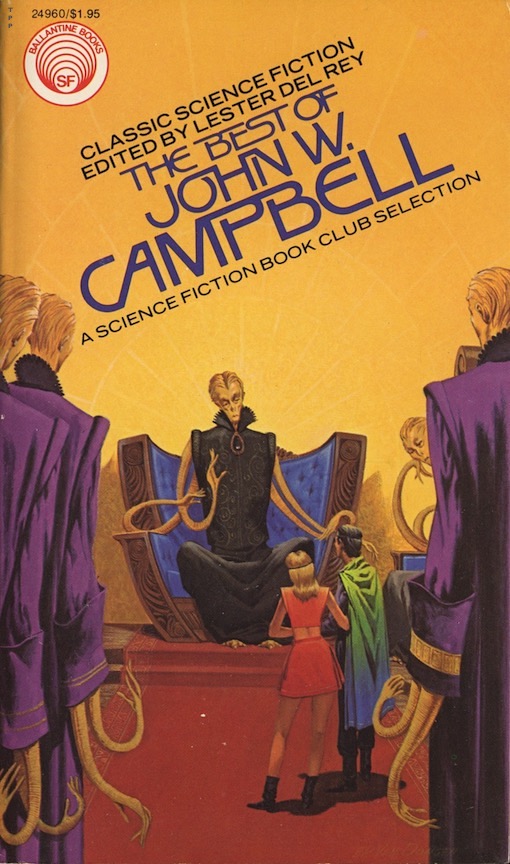
Henry Richard Van Dongen (1920- 2010), to quote someone else, "was widely recognized for his ability to read a story, extract the
precise meaning of the author’s intent, and convey it through pictures." Indeed he was. And nobody was more pleased about that than me, who took an immediate shine to the apparent faithfulness of his artwork upon seeing this particular Best Of cover, which exactly illustrates Campbell's 1937 story, "Out of Night." This also happens to be one of the first paperback covers that Van Dongen produced after a fifteen year hiatus from the publishing field (he was a prolific producer of pulp SF covers from 1950 to 1961 before switching to architectural advertising). His tall, lean, long-necked man looked a lot like I did back then, and although that same leanness found its way onto most of his human figures (aliens too on occasion), that was somehow okay because it was that very distinctiveness that made his covers so fascinating to look at.
As concerns John W. Campbell; just ignore his politics and pugnaciousness, separate the art from the artist, and read these three stories: "Twilight," "Forgetfulness," and "Who Goes There?" (filmed three times as The Thing). Classics, each and every one!


If you're willing to believe that on Earth there is a desert filled with rocket-ships that can transport people to the planet Venus, a supposed tropical paradise where homesteading is not only allowed but strongly encouraged, then according to Cyril M. Kornbluth, you're not alone. In his most famous story, "The Marching Morons," billions of humans are willing to take that journey, without questioning anything. Hence the term, 'morons.' And, according to Ellis's cover, all you need to bring with you is a duffel bag! Voilà! Earth's overpopulation problems are solved.
Kornbluth, who collaborated with Frederik Pohl on one of the genre's most respected satirical novels, The Space Merchants (1952), had a meteoric career in science fiction that was tragically cut short in 1958 at the age of 34 by a heart attack. The heights he might have achieved after this can only be speculated upon, but it's safe to say that his stature as a writer, and not necessarily that of a SF writer, would have grown exponentially. You see, the talented Kornbluth was already writing and publishing works outside of the genre. It was only a matter of time before he started to produce works that were every bit as biting as his science fiction. Time, unfortunately, was what he didn't have on his side.
"... As a person [Kornbluth] was what he was as a writer: bright sardonic, and immensely rewarding. Cyril had a great deal to say, and he said it all tersely, wittily, and with grace. I do not think we shall soon see his like again." --- Frederik Pohl, from the Introduction


Vincent Di Fate has been painting SF hardware, or gadgets, for so long now, and for so incredibly well, that it's a wonder that he isn't credited with inventing the medium. His humans are fairly well drawn too. Here we have his depiction of the 1963 Philip K. Dick story, "If There Were No Benny Cemoli," showing a giant image of 'Benny' transposed on the side of a building. Benny's a wanted fugitive (and no, not for abusing togas in public), accused of disrupting the world's proceedings by initiating wars and other infractions. It amazes me to see that so much of what PKD presented in 1963 in "Benny" is still wreaking havoc on us today, including his title character's insurrection. Consider this: data mining, algorithms, real news, fake news, predilection, politicizing, bureaucracy, truth, lies, deception, falsification, treason, denial and enablement. Oh, and let's not forget 'Witch Hunt', ha ha!
"I do not want to live in the sort of world Dick is so good at describing. I wish---I desperately wish---that I dared believe we don't. Maybe if a lot of people read Dick's works I'll stand a better chance of not living in that world..." --- John Brunner, from the Introduction


It's not hoarding if it's books, right? Somewhere in my vast piles of books, er, I mean, neatly arranged, stacked, and shelved books, is a copy of The Best of Fredric Brown with its cutesy Van Dongen cover art. I know it's there. It has to be, I would never let it go. Of course I had never read Fredric Brown before this volume was published, but like all SF fans, I knew what he had done novel-wise in the genre. Not being a big humor guy, I had always avoided his supposed classics, What Mad Universe and Martians Go Home. But after absorbing the very entertaining short stories in this book, some shorter than the shortest shorts ever written, I was ready to take them both on. And then, after discovering that Brown wrote some well-regarded mysteries too, some bordering on horror, well--I was suddenly intrigued with everything he did. But where to find it?
Enter Arthur "Art" Hackathorn, pulp collector extraordinaire (Art had complete runs of Doc Savage and many other pulp magazines and could tell you what Frank Gruber ate for breakfast every day). "Pick any paperback you want from the boxes upstairs," he said. "3 bucks apiece." Almost immediately I spotted the vintage Brown's, dozens of them it seemed: The Screaming Mimi, Here Comes A Candle, Madball, The Far Cry, Night of the Jabberwock, The Leinient Beast, The Murderers, and many many more including his SF. I bought them all. I was now a certified Brownzian. Thank you, Art. Rest in peace, brother.
'Imagine ghosts, gods and devils.
Imagine hells and heavens, cities floating in the sky and cities sunken in the sea.
Unicorns and centaurs. Witches, warlocks, jinns and banshees.
Angels and harpies. Charms and incantations. Elementals, familiars, demons.
Easy to imagine all of those things: mankind has been imagining them for thousands of years.
Imagine spaceships and the future.
Easy to imagine; the future is really coming and there'll be spaceships in it.
Is there then anything that's really hard to imagine?
Of course there is.
Imagine a piece of matter and yourself inside it, yourself, aware, thinking and therefore knowing you exist, able to move that piece of matter that you're in, to make it sleep or wake, make love or walk uphill.
Imagine a universe--infinite or not, as you wish to picture it--with a billion, billion, billion suns in it.
Imagine a blob of mud whirling madly around one of those suns.
Imagine yourself standing on that blob of mud, whirling with it, whirling through time and space to an unknown destination.
Imagine!'
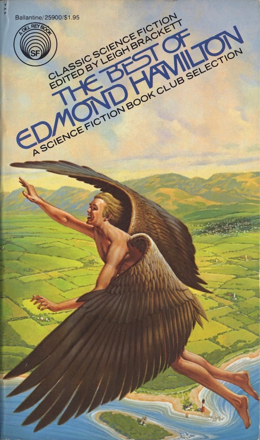
I was a fan of Edmond Hamilton before I even knew who he was. I grew up reading DC comics: World's Finest, Action Comics, Adventure Comics, Detective Comics, Superman, Batman, Superman's Pal Jimmy Olsen, among many many others. I loved the Legion of Super-heroes, quite often the featured characters in Adventure Comics (what is it about kids wanting to be part of a team, or group, or gang? Is something missing from our lives?). Back then I didn't know who wrote these things, nor did I care (I was interested in the artists though). To learn later that Hamilton, dubbed the 'World-Wrecker' and 'World Saver' by SF fans for his impressive canon of space-opera, was responsible for so many of my favorite comic book stories was a real surprise. Wow. Also surprising was that from among the stories gathered in The Best of Edmond Hamilton, it's the non-space opera stuff I like the best. All of it was published first in Weird Tales magazine between 1926 and 1946. Tops among them is the Van Dongen cover art story, "He That Hath Wings."
"...He [Edmond Hamilton] sat in the press box at Cape Kennedy and watched Apollo 12 take off in flame and thunder, just as he had written it a hundred times, and there was a thrill to it that no child of the space age will ever quite know. He had predicted, accurately, the year when men would first land on the moon, but he never really believed that it would actually happen while he was still around to see it. Now that it has happened, and the first step into a wider universe has been taken, he profoundly hopes that mankind will not falter and turn back. The future is Out There." --- Leigh Brackett, from the Introduction.


Leigh Brackett, like her colleague Catherine L. Moore, was a godsend to me as a young reader. And not because of the novelty of her being a woman writing in a genre dominated by men. Really, I could've cared less about that (although in my mind I did picture her quite favorably without ever knowing what she looked like). It was because I was a fan of Robert E. Howard, and thus was always searching for more blood & thunder. With Brackett's swashbuckling, sun-blackened Eric John Stark, and Moore's sword-wielding hottie Jirel, I found it---a lot of it actually (albeit less bloody than I would have liked)---and it more than slaked my thirst for bold, atmospheric adventure. Brackett didn't actually write sword & sorcery, more like science-fantasy, or planetary-romance as some prefer to call it, but it got my blood racing just the same. Brackett wasn't just a one-sword-scabbard though, she also wrote mysteries, westerns, and big-time screenplays for Hollywood, among them, The Big Sleep, Rio Bravo, Gold of the Seven Saints, Rio Lobo and The Long Goodbye. Remember The Empire Strikes Back? Yeah, that was Brackett too.
Boris Vallejo seemed to me to be an inspired choice to produce the cover art on The Best of Leigh Brackett. His figures always look like they're going to leap off the cover; exuding the same kinds of energy and vitality that Brackett generally fused into her science-fantasy stories. Vallejo, while not without his detractors, has always been one of SFF's most unique and stylish practitioners. His hyper-realistic artwork is instantly recognizable, with or without his trademark signature. He came on the scene in 1971 at about the same time as his artist friend Bob Larkin did, producing magazine covers for Warren Publications, Marvel Comics, and in 1975 paperback covers for Edgar Rice Burroughs novels. Boris proved from the outset that he could sculpt a female buttock just as prodigiously as Frank Frazetta, while refraining from copying the master verbatim. Boris always was unmistakably Boris. Larkin stopped producing cover art a few years ago and is now enjoying a much deserved semi-retirement, but his pal Vallejo still produces covers, but only the ones for his own art books (and calendars) which as of yet show no sign of receding.


As I said earlier, Paul Alexander (1937-2021) was one of science fiction's greatest hardware and gadget illustrators. On the surface that make's him seem like an odd choice to produce the cover art on The Best of Robert Bloch, a writer celebrated more for his fantasy, suspense and crime fiction than his science fiction. But Del Rey's instructions to Bloch were for him to choose mostly SF stories for this collection, even if those final selections don't exactly belie that order. For one thing, Bloch's fantasy classic, "That Hellbound Train," is the centerpiece of the collection. But when I discovered that Alexander was a model train collector who also liked to paint trains, it suddenly made sense to me why he was tapped. Not only that, but Alexander's sharp, realistic style fits in perfectly with what has already been done in the series. And really, do you think there's another train illustration out there that could represent Bloch's story as good as this one?
"Best is---at best---a subjective label. As the cannibals used to say, one man's meat is another man's person. What I happen to prefer may be caviar to the general, or sardines to the admirer of MOBY DICK." --- Robert Bloch, from the Afterword
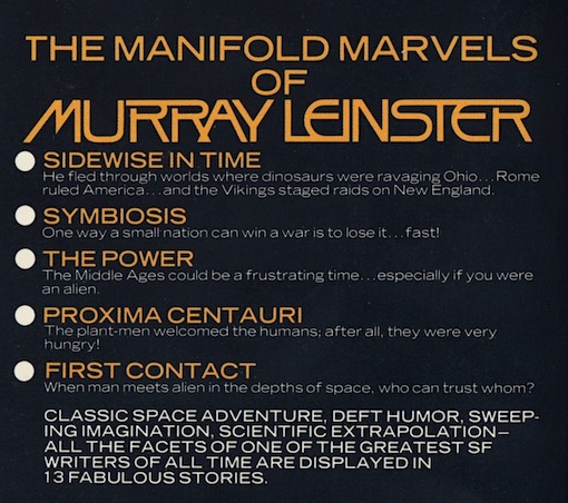

Finally, on the cover of the fourteenth volume in the series we get a 'Bug-Eyed Monster.' About time too! Golden Age science fiction is famous for its BEM's, but also condemned for it too, especially when outsiders are critiquing it. Somehow I knew that if a BEM did show up it would be the product of Van Dongen, who during the previous year had produced a pair of good ones on other Del Rey releases. Van Dongen's illustration depicts a scene from "The Power," in which a 15th-century alchemist conjures up a demon, in reality, an off-world alien, the last of its kind.
In his introduction, Pierce called Murray Leinster the 'Dean of Science Fiction' and I would have to agree with that. When I was young and wanted to write my own SF I came up with what I thought was an original idea, that of spacefaring humans exploring an actual sentient planet. Guess what? Leinster beat me to it in 1949, in "The Lonely Planet." Leinster (pronounced Lenster) is actually Will F. Jenkins (full name: William Fitzgerald Jenkins, 1896-1975). Just recently, by sheer happenstance, I read two stories by Jenkins in a Saturday Evening Post anthology, not even knowing it was Leinster. One was "Doomsday Deferred," and the other was "The Little Terror." Both nicely done pieces with more than a touch of scare in them. It turns out that Jenkins/Leinster wrote more than 1500 short stories and articles, 14 movies scripts and hundreds of radios scripts and television plays in addition to at least 40 novels (some are fix-ups). So if you happen to come across his work like I did in your fiction wanderings, don't pass him over. He's worth your time. Just beware that a couple of his novels were altered by unscrupulous paperback publishers, and not for the better I've heard.
"Murray Leinster was a man who was interested in the world---in people and ideas. Too many writers can't seem to get interested in anything but themselves. Just as the best teacher is the one who can get excited about what he's teaching, the best writer is the one who can get excited about what he's writing. Leinster could and did, and his stories still communicate that excitement." --- John J. Pierce, from the Introduction


This is Darrel K. Sweet again at his very best. It's the kind of colorful scene that draws you in; exotic characters, one wearing a massive plumed headdress, being threatened by a monstrous, magnificent looking dragon. The stuff of classic fantasy. Sweet's cover art illustrates a scene from L. Sprague de Camp's 1973 story, "The Emperor's Fan." The fan you see clutched is a magical one, one that can make objects disappear. But do they come back?
I know de Camp well from his Robert E. Howard editing, REH biography, Conan pastiches and The Clocks of Iraz, none of which impressed me all that much, or as much as they should. I also read The Prisoner of Zhamanak, which didn't rattle my cage enough to do any further reading in his Krishna series (loved the Poyser and Alexander covers though. Wow!). Those sentiments must have made me put aside The Best of L. Sprague de Camp, because the only story in it that I'm familiar with is "A Gun For Dinosaur," which I probably read elsewhere. In preparing this post I did read the cover story, a droll bit of storytelling which, surprise surprise, I thoroughly enjoyed. According to James McGlothlin's rather positive review of this collection in Blackgate, de Camp exhibited in his stories a wide range of subject matter, themes and styles, and was consistently funny too. Maybe it's time to give de Camp's short fiction a second chance and find out for myself what all that fuss was about.
"... humor became an emblem of [de Camp] in his science fiction, doubly welcome because it has always been in short supply there, and in fantasy, where it matched the funniest things ever done in a field which has nurtured a lot of sprightliness. His humor was often called 'wacky,' but I think that's the wrong word. De Camp constructed his stories every bit as carefully, with the same respect for fact and logic, as he did his non-fiction. Much of the laughter came from the meticulously detailed working out of the consequences of a bizarre assumption." --- Poul Anderson, from the Introduction


I bought this volume and the Frederik Pohl volume at a Mile-High Comics store on East Colfax Ave & Fillmore St. in Denver in 1978. That was a few years before my softball teammate, Ray Barber, bought the store, changing the name to All In A Dream Comics (he's now at E. Colfax & St. Paul). It was a book signing event with Jack Williamson, one of the true greats of science fiction, and his long time friend and teammate, Frederik Pohl. Also there that day with pen in hand was a young George R. R. Martin. He was promoting his first novel, Dying of the Light, during its initial paperback run. I'm pretty sure I read that book before I delved into these two Best Of's. I followed GRRM's career closely after that and have not been surprised at the success he's had. You could almost see it coming in every sentence he wrote.
I had been aware of Ralph Angus McQuarrie even before GRRM, that is, ever since Star Wars became, well, what it is. I even bought the spinoffs novels that were published in 1976. That first one, Star Wars, From the Adventures of Luke Skywalker, was an absolute gem! (the cover art I mean). After that I kept my eye on dozens of other paperback covers that McQuarrie produced over the years. He was immensely talented, designing not only the look of Darth Vader, but Chewbacca, R2-D2 and C-3PO. He also designed nearly all of the concepts that were used in episodes 4, 5, and 6. Even at the time he produced this cover for The Best of Jack Williamson, he was already a master at creating cool looking robots, in silver, gold, and now black.
"His (McQuarrie) genial contribution, in the form of unequaled production paintings, propelled and inspired all of the cast and crew of the original STAR WARS trilogy. When words could not convey my ideas, I could always point to one of Ralph's fabulous illustrations and say, 'do it like this." --- George Lucas


Since rebooting his SFF career in in 1976, Van Dongen was averaging about one cover painting per month (whatever else he was doing commercially is unknown to me). As always, his artwork remained faithful to each book's contents. This particular cover depicts the 1939 story, "The Shadow of the Veil." All Van Dongen had to work with in order to achieve the look of the "Surf," the creature seen in the right foreground, was the following: "... massive, horn-plated head... sloping, walruslike shoulders... gargantuan frame... huge, flipperlike paws, adapted both for swimming and for the handling of objects... moving erect on his hind feet, but shuffling awkwardly..." Given the brevity of the descriptions, Van Dongen's adaptation is amazingly good. Also drawn well are the swamp monster and the towering, black metal statue, again from concision. The bag apparently is an offering to the ruling statue (who it's best not to piss off), an excessive tax burden to the middle-class by any other name.
This volume, like the de Camp, I set aside for a rainy day that never came. Not that I don't like 'old-school science fiction' because I do (I enjoyed the cover art story very much after reading it in preparation for this post). But it may be that after absorbing so much of it in my teens, I had had enough of its ways and means, although I never tire of its sense of wonder. That said, modernites like Pohl and Cordwainer Smith can be tough pills to swallow too at times. It really comes down to a writer's ability to draw you in inexorably no matter what the subject is, like a good cover artist does. Gallun certainly had me with "The Shadow of the Veil"---maybe, just maybe, I should try reading more of his stuff.


Lester Del Rey loved robots. So do I (although AI scares the hell out of me!), beginning with the fantastic robots in Magnus Robot Fighter, a major comic book from my youth that was illustrated by the great Russ Manning. Though I never went out of my way to read about them after that, with perhaps the exception being Asimov's "The Bicentennial Man." I did read, long before this collection came out, and for no other reason than they happened to be in an anthology I was perusing, Del Rey's most famous robot stories "Helen O'Loy," and "Into Thy Hands." They impressed me quite a bit, so in this collection I immediately turned to his other noted robot tale, "Vengeance is Mine." It did not disappoint either. On that note it should be said that every SF illustrator worth his easel has painted a robot or two. Van Dongen has quite a few to his name, but none better than this illustration depicting that latter robot story. I particularly like his R2D2 inclusion. Classic sleight of brush!
"[Harlan Ellison, reminiscing about writing his first short story while staying at Del Rey's house] ... Lester was unfailingly helpful. He would walk up behind me, read what I'd typed, see it was syntactically crippled, and bat me across the back of my head. "Not who, dummy! Whom!" He provided auctorial tips, he showed me how to cobble up the extrapolative science that would make my specious concepts work, he edited the manuscript. Evie fed me (Lester's first wife). (...) Algis Budrys and Andre Norton were the first writers to take an interest in me, (but) Lester was the one who got me thinking and writing as a professional. He wasn't kind, he was murderous; and that is a brutal treasure more valuable than all the strokes given by well-intentioned and inept amateurs who do not perceive one one-millionth as clearly as Lester did that writing is a killing craft, and only the tough survive and prevail. For that savaging, I will always love and honor Lester." --- Harlan Ellison, from an excerpt within the Introduction

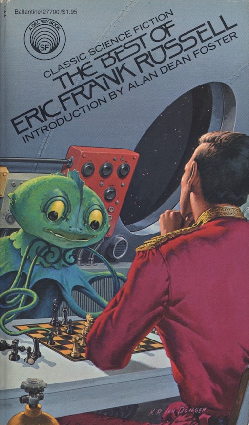
I am hurtling towards the fiery sun in an unstoppable, uncontrollable spaceship and a chess game breaks out! Huh? Reminds me of the time I went to a fight and a hockey game broke out! In Eric Frank Russell's story, "Jay Score," Martians are chess playing fanatics, kibitzers too, and liable to start the engagement of chess at any given moment, or situation, even if the ship they are on is on a one way trip to total incineration! Oh to have such passion for such a time-sucking, tedious activity! (For all my flippancy, this is a highly entertaining story and possibly my favorite from this collection).
Van Dongen was forced to construct his Martian with barely any description from Russell. 'Goggle-eyed' and 'tentacled.' That was pretty much it, unless you count his mention of suction cups too. But that's what makes the art of reading so uniquely unique, being able to use your imagination to fill in the gaps where it's needed. Illustrators do it as a matter of course. Now, why a creature that's adapted to a desert planet would need suction cups is well... c'mon, just use that blasted imagination, will ya!
"He (Eric Frank Russell, 1905-1978) was the only one of many miners of the imagination, of that peculiar dimension labeled science fiction, who could make me both laugh and cry. He displayed more simple common sense in a short story than most writers did in a full novel. He possessed an empathy for mankind unmatched by any other SF writer I've known. He wrote stories about ecology before it existed as a pop term. He exhibited racial understanding in a time when it was unpopular... In Russell's stories the science is minimal, the romanticism muted where present. We are confronted by a writer whose prime interests are psychology and sociology, not quantum mechanics. Adventure is the sometime vehicle used to explore the depths of human emotion instead of the physical cosmos. It was the universe within that most intrigued Russell." --- Alan Dean Foster, from the Introduction


Barclay Shaw has been producing stunning works of art on book covers and magazines since 1978. His paintings are easily distinguished by their clarity, color, composition and competence. The Best of Eric Frank Russell was one of four Russell cover illustrations he produced for Del Rey Books in 1986. The others are, Wasp, Three to Conquer, and Sentinels from Space. Ironically, Shaw chose to depict "Dear Devil" (1950) for Russell's Best Of cover, the only other story in the collection with Martians in it. Written nine years after "Jay Score," Russell's red-planet-denizen's are now bigger and bulkier with large 'multifaceted eyes' and apparently of no relation to his earlier concoctions. They still slither around on tentacles though. Their goal, or the goal of one of them, is to make contact with the ravaged survivors of a post-apocalyptic earth. Shaw pretty much gets it right with his take, omitting just their described blueish sheen in favor of brown. Illustrators have a right to take some liberties, don't they?


I've always meant to read Hal Clement's Mission of Gravity, really I did, along with this volume. But I'm not a 'Hard' science fiction guy, so I didn't. But I have enjoyed that category of science fiction many times in the past, dozens and dozens of times it seems, sometimes not even realizing that I was in that category. Consider these favorite SF novels of mine that come easily to mind: The Andromeda Strain, A Barnstormer in Oz, Contact, Downbelow Station, Foundation, The Fountains of Paradise, Jurassic Park, Rendezvous with Rama, Ringworld, Tau Zero, and Timescape. Of the shorter works I've read there are just too many to list, but I don't think Clement has been among them. I certainly don't remember reading anything by him.
So, the time has come to remedy that, as befits this article.
"Assumption Unjustified" (the cover art story with Van Dongen's remarkable rendering of its alien) is about a pair of amphibious aliens who divert their spaceship to earth in order to obtain something that is vital to their continuance. Their knowledge of earth's inhabitants, or lack of it as it turns out, ends up being a hindrance, creating a series of errors for them. I've never been one to take something out of context from the time in which it was written, in this case 1946, and I know I'm supposed to suspend my disbelief when reading anything related to the 'fantastics' (remember my 'c'mon, will ya'?) but I still found myself scoffing at nearly everything that Clement was pushing. First off, how could these aliens have built a spaceship, let alone mine and process the materials needed for it, with only four thin tentacled appendages, each the equivalent of a human arm and hand but with only a fraction of its strength? Being amphibians, why are their portable communication devices not waterproof? How come they don't have something as simple as binoculars to use? Why does the male have to create an elaborate science experiment just to capture an earthling when a stun-gun or a tranquilizer dart would probably do the trick even better? Why is it that the male has to mansplain everything to the female--is she supposed to be mentally inferior? (I know, I know, it's the 1940's!). I could go on and on but the bottom line is that this is a poorly thought out story in my opinion. Which begs the question: will I read more stories by Hal Clement, the so-called master of rationality?
No. I don't believe I will.
"Hard science fiction is that branch which tries to stick rigorously to the known facts of the physical sciences. For example, lacking air or friction in space, rockets couldn't twist and turn like World War I airplanes. And since every action produces an equal and opposite reaction, Superman couldn't leap from a roof to a height of one mile without demolishing the building from which he jumped. And so on... Hal Clement is generally recognized as the master of hard science fiction. He has done the seemingly impossible by creating a major body of speculative fiction while maintaining complete reliance on rationality." ---Lester Del Rey, from the Introduction


The Best of James Blish was Van Dongen's ninth and final cover illustration in the series. It was one of his best although to me they're all equally awesome. At first I didn't realize I was staring at an underwater scene, the absence of any effervescence threw my perception off a little, but only for a second or two. In "Surface Tension" (1952), aquatic, microscopic humans are living in a small body of water, very large to them of course but in reality just a mere puddle. Being human, with ancestral abilities but no memories beyond that, they are constantly fighting for survival in their watery world, constantly developing their technology and science, constantly yearning for a greater existence beyond that which they know. Being human, they eventually devise a way to travel beyond the surface tension above and out into the upper world. If that sounds pretty cool to you it's because it is, it really is. "Surface Tension," while not without a dull page or two (and a complete lack of substantive females), is one of the most inventive and interesting stories I've ever read. A deserving SF Hall of Fame selection, Blish's story can also be seen as an metaphor of our exploration into space, as well as earth's biological history, when life emerged from the sea to conquer the land.
"Like all true artists (as Richard Strauss once noted), James Blish did not strive for originality. Yet, his best works are original, whatever their origins. His drive to improve science fiction bore fruit during his lifetime and several of today's better writers acknowledge their debt to him, having learned from him to do it the hard way. But with love---always with love." --- Robert A. W. Lowndes, from the Introduction


Having Michael Whelan produce two very large panel-sized paintings that could be used in triptych fashion to cover as many as six separate H. P. Lovecraft paperbacks was, in a word, brilliant. The Best of H. P. Lovecraft was one of those six books, except it featured both paintings, one on the front and one on the back, in wraparound style. Unfortunately, the far left side was cut off, which to me was visually the best section of either painting. Still, an attractive and important book and one I wish I would have grabbed back when it was new. The thing is, I already owned a dozen Lovecraft's when this edition came out, and this book with its change in design and font layout just didn't fit in with the other Best Of volumes so I decided to skip it (if I had known Bloch's introduction was as good as it is I wouldn't have!). A great collection of stories though, with at least ten of the sixteen stories being science fiction in the strictest sense of the meaning.
Whelan's career is fascinating because he started out merely as a good, competent illustrator, and then kept getting better and better until he became what he is today--the benchmark for excellence in SFF art. The next time you're at Barnes & Noble, see if you don't agree with me that his fantasy covers stand out like beacons in a sea of digitally construed drabness.
"While imaginary worlds abound in modern fantasy, few of today's writers set their sagas in Poictesme, Perelanda, or Middle-earth. But stories and novels based on the Cthulhu Mythos continue to proliferate. In terms of imitation and inspiration, Lovecraft may well have had more influence on other writers than any contemporary except Ernest Hemingway." --- Robert Bloch, from the Introduction
"Lovecraft is the Nicolaus Copernicus of the horror story." --- Fritz Leiber


Let's assume that this kaleidoscope of color from Barclay Shaw is highlighting a particular story in The Best of John Brunner, but in saying that I really don't know. Before coming across this vivid painting I never even knew that a Best Of volume for Brunner existed. Since then I've tried to find a clean used copy, but other than what's listed online I've not come across a single one in any of my Denver Metro area used bookstores (which also includes Boulder, Colorado Springs and Fort Collins). Was it vastly under-printed, or is it simply that Brunner fans in my region are unwilling to part with his better books?--(his lesser works are overflowing like romance novels in a used bookstore). Shaw produced another color blast for Brunner's somewhat notable novel, The Shockwave Rider, but I've not seen that item either. But that was apparently it for Shaw, the other big Brunner titles being reprinted back then featured other artists.
"John Brunner's dystopic novels, STAND ON ZANZIBAR and THE SHEEP LOOK UP, had a profound effect on most science fiction writers of my generation, who began publishing their work in the late 60's and early 70's. The freewheeling style and complex structure of the books, along with their unrelenting antiestablishmentarian pessimism, made science fiction seem a hospitable home indeed for young writers willing to take chances, eager to stab at the status quo." --- Joe Haldeman, from the Introduction.
Each artist began their book cover careers in the mid-1970's, except for Dean Ellis, who began in 1965, and Barclay Shaw in 1980. All but three stayed the course until genre publishing began to slowly change over to digital design in the late 20th and early 21st centuries (a few have adapted and kept going). If added together, their book covers would number well into the thousands.
Dean Ellis left in 1983 to pursue other commercial art opportunities; he died in 2009.
H. R. Van Dongen retired from publishing in 1983, and is no longer with us.
Ralph McQuarrie retired in 1988, and has since passed away.
The Hildebrandts went solo before Tim died prematurely in 2006; Greg is still painting up a legend though.
Darrell K. Sweet died in 2011 while still very much in demand and active as a book cover illustrator.
Paul Alexander retired from publishing in 1998: and passed away only recently.
Michael Herring is no longer active in producing cover art.
Barclay Shaw is doing mostly digital art these days.
Vincent Di Fate hasn't produced a new book cover in quite some time, although it's hard to keep a good man from doing what he does as good as anyone.
Boris Vallejo is as iconic as ever.
And Michael Whelan, well--he is still every SFF and horror authors best corner man.