I'VE been collecting the various Ballantine/Del Rey mass-market paperback editions of J.R.R. Tolkien's masterpiece, The Hobbit, and its famous sequel, The Lord of the Rings, since I was a teenager in the late 1960's.
For my purposes I only wanted the ones with actual illustrated covers. I don't necessarily need to have key first printings, although like most book collectors I do prefer them. Granted, this hasn't been a difficult mission because there haven't been many cover changes since the books were first published in the United States by Ballantine in 1965. According to the data gathered at TolkienBooks.US, only six for TH, and seven for LOTR (not counting the photo editions or the re-juxtaposition of the same illustration).

The first Ballantine paperback edition of The Hobbit was published in August, 1965 (Catalog ID: U7039), two months in advance of their The Lord of the Rings paperback editions. Artist Barbara Remington was chosen to illustrate the covers. Remington was forced to embellish her illustration after she was given only a vague description of the story by the editor. That's why she drafted a lion, a fruit tree and a pair of emus into her scene, none of which, of course, are found in the book. Tolkien was not happy with her artistic liberties and at his insistence the 'big cat' was erased from all subsequent printings (though inexplicably, none of the other discrepancies were), turning this first printing into an instant collector's commodity. My original copy, which I read to near ruin, was one of the later printings, and I consider myself very lucky to have been able to purchase this now very rare, fine first printing (offset flaws and all), decades after the fact and at a reasonable price.


 |
| CLICK ON IMAGE TO ENLARGE |
Seen above are:
The Two Towers (Ballantine U7041, Oct, 1966, 6th printing, Remington art. Apologies for the scuffed cover).
The Return of the King (Ballantine U7042, Oct, 1966, 7th printing, Remington art).

 |
| 1965 ACE EDITIONS: Cover Art by JACK GAUGHAN. CLICK ON IMAGE TO ENLARGE |
"Not so fast!" said Tolkien, drawing Sting from its scabbard! Then, after a long year of much legal wrangling and continual threats from Sting, the statement was deemed no longer necessary, every pirated edition having been either sold off or removed from stores by Ace and yet it stayed on the back until it was replaced in 1973 by a color photograph of a now obviously happy Tolkien.


The Hobbit (Ballantine 25342, Aug, 1976, 60th printing, Tolkien art. Photo of Tolkien credited to Billett Potter).


Also in 1973, Tolkien's art replaced Remington's art on all three LOTR volumes. His "Hobbiton-across-the water" became the new TFOTR, while "Taur-na-fúin" (Fanghorn Forest) was selected for TTT, and finally, "Barad-dir" for TROTK. All three illustrations were done in pencil, ink and watercolor. The original works were, like Tolkien's drawing for TH, much taller and considerably wider that what was actually allowed on the books.
Seen above are:
The Fellowship of the Ring (Ballantine 25343, Jun, 1976, 57th, Tolkien art).
The Two Towers (Ballantine 25344, Aug, 1976, 54th, Tolkien art).
The Return of the King (Ballantine 25345, Aug, 1976, 53rd, Tolkien art).

 |
| CLICK ON IMAGE TO ENLARGE |

 |
| CLICK ON IMAGE TO ENLARGE |
 |
| CLICK ON IMAGE TO ENLARGE |

 |
| CLICK ON IMAGE TO ENLARGE |
Love him, hate him, or indifferent, there's still no denying the fact that Darrell Sweet was an absolute giant in the field of fantasy. His cover art career, spanning nearly forty years, was both epic in productivity and in quality. His unique, colorful illustrations promoted some of the biggest names in the genre too, such as Piers Anthony, Peter S. Beagle, Terry Brooks, Lord Dunsany, Robert Jordan, Katherine Kurtz, Patricia A. McKillip, L. E. Modesitt, Jr., and Tolkien, to name just a few. Would the Wheel of Time have been as successful without Sweet? Well, yes, almost certainly, but regardless, his contribution to Jordan's overall success cannot be overlooked, or for that matter even properly measured.
Seen above are:
The Hobbit (Ballantine 31858, May, 1984, 8th, Silver Jubilee, Sweet art).
The Fellowship of the Ring (Ballantine 29605, Mar, 1984, 1st, Silver Jubilee, Sweet art).
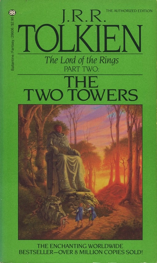
The Two Towers (Ballantine 29606, Apr, 1984, 77th, Silver Jubilee, Sweet art).
The Return of the King (Ballantine 33209, Apr, 1984, 73rd, Silver Jubilee, Sweet art).


In 1986 Ballantine went back to the same Tolkien art that was used previously. New font and color borders were then added. Although the illustrations were now smaller than their initial presentations, somehow they seemed bolder and more enhanced. Helping matters considerably were probable improvements in both scanning and printing techniques; now each illustration rang truer to their original source material (that being said, smaller made it even harder to make out Mount Doom's volcanic activity on TROTK).
Seen above are:
The Hobbit (Ballantine 33968, Jul, 1986, *17th, Tolkien art).
The Fellowship of the Ring (Ballantine 33970, Jul, 1987, *9th, Tolkien art).
The Two Towers (Ballantine 33971, Jul, 1987, 82nd, Tolkien art).
The Return of the King (Ballantine 33973, Apr, 1987, 79th, Tolkien art).
*(Apparently, during Sweet's time a revised edition of TH was put forth, hence the print number starting back at 1 again, and possibly with LOTR as well, although their numbers didn't change with the exception of the 1987 TFOTR which was now marked as being a 9th. It's all terribly confusing).


Don't judge Michael Herring on the strength of this cover art featured on the 1988 edition of TH and 1987 LOTR's. Instead, take the time to seek out the rest of his artwork, of which there are at least four decades worth of great material, representing fantasy and science fiction but also adventure, romance and mystery. Herring is noted for producing outstanding cover illustrations for popular series such as Baum's Oz, Burrough's The Land That Time Forgot, Don Pendleton's Mack Bolan, Jerry Ahern's T.R.A.C.K., and Stephen Greenleaf's John Marshall Tanner Mysteries--and if that doesn't make your eyes open then take a look at the stone cold brilliance of his James Axler's Deathlands series covers.
Seen above are:
The Hobbit (Ballantine 33968, Jan, 1992, 34th, Special Book Club Edition Box Set, Herring art).
The Fellowship of the Ring (Ballantine 33970, Jan, 1993, 20th, Special Book Club Edition Box Set, Herring art).
The Two Towers (Ballantine 33971, May, 1993, 15th, Special Book Club Edition Box Set, Herring art).
The Return of the King (Ballantine 33973, May, 1993, 19th, Special Book Club Edition Box Set, Herring art).


Ted Naismith produced an entire portfolio of illustrations devoted to Tolkien's works, and if you can somehow view any of them on a larger scale, or in their sequential entirety, then you will appreciate even more the absolute brilliance of what he did depicting Middle-Earth and its inhabitants. His color illustrations are some of the most definitive to date by any artist working under Tolkien's banner. These paperback editions, part of a box set, were issued in the year 2000.
Seen above are:
The Hobbit (Del Rey 33968, 2000, 104th, Naismith art).
The Fellowship of the Ring (Del Rey, 33970, 2000, 98th, Naismith art).
The Two Towers (Del Rey 33971, 2000, 92nd, Naismith art).
The Return of the King (Del Rey 33973, 2000, 95th, Naismith art).


John Howe was another artist who truly "got" Tolkien, and like Naismith, he also has an extensive portfolio of paintings and sketches devoted to Middle-Earth and its inhabitants. Nevertheless, the 2007 editions of LOTR, aren't what I would call his best foot forward, largely due to the cover's terribly restrictive design, but if you could see his artwork in their proper scale and clarity, you would be suitably impressed. This though is the one LOTR set that I don't own--somehow it went under my radar. I hope to fix that in the near future.
Seen above are:
*(Note: Howe's art was not used on any TH mass-market paperback printings).
The Fellowship of the Ring (Del Rey, 2007, 138th, Howe art).
The Two Towers (Del Rey, 2007, 134th, Howe art).
The Return of the King (Del Rey, 2007, 136th, Howe art).


In 2018 Del Rey replaced its LOTR movie-tie-in photo covers, which had been issued off and on since TFOTR's film debut in 2001, with drawings by the "psychedelic" artist Michael James Bowman. These attractive covers were a welcome change from the staidness of the photo editions. In 2020, TH was also reissued with Bowman's art, followed by the entire Tolkien canon. You would be hard pressed to find a more handsomely designed set of twelve paperbacks anywhere on Earth, or Middle-Earth.
Seen above are:
The Hobbit (Del Rey, Jun, 2020, Bowman art).
The Fellowship of the Ring (Del Rey, 2018, 165th, Bowman art).
The Two Towers (Del Rey, 2018, 154th, Bowman art).
The Return of the King (Del Rey, 2018, 154th, Bowman art).

SOMEHOW, inexplicably, I've managed to hang on to the map of Middle-Earth (seen above) that hung on my bedroom wall throughout junior and senior high school. It's now dog-eared and wrinkled, so much so that it now resembles an ancient treasure map. I still cherish it though. It was drawn and embellished in 1969 by Pauline Baynes, but based on the cartography of Tolkien. In 1970 it was issued in poster format and sold in bookstores for a mere $2.50, which I promptly bought. To this day it remains one the greatest gifts that any artist has ever given to fans of Middle-Earth. Barbara Remington also had a map-poster constructed from her cover art, and it too is a treasure for all time.
 |
| Map of Middle-Earth by Pauline Baynes: Click to Enlarge |
 | |||
| Map of Middle-Earth by Barbara Remington: Click to Enlarge |

[© February, 2021, Jeffersen]
12 comments:
Thanks very much for this! I got those late-1970’s copies with Tolkien watercolors for my first reading. Have owned (and given away) several other editions, but I’ve always kept those first copies. I hate to say it, but if I had been a bit younger, and those Darrell Sweet covers were in the racks when I spotted the books, I probably never would have read them.
In regards to the Ted Naismith paperbacks from 2000 - I have stumbled across a set with the same illustrations yet the covers are different. The JRR is more central etc. Its the same cocer just a variation on the design.. are you aware of these? I am desperately trying to complete my set of these but cannot find them anywhere!
To Unknown: My Naismith's were sold as a box set, and I'm not sure if I've seen the ones that you stumbled upon. I'm assuming that you would like a set like mine (?). I plan on hitting up a couple of used bookstores soon so I'll keep my eye open for any other Naismith's. If if find any I'll let you know via a comment.
The 1973 artwork, done by Tolkein himself, was all I ever knew as a child and those are the editions we had in our home, even though I didn't read them until the early 80's. I got into the books the same way a lot of people probably got into them...because of a parent or older sibling. In my case I had 2 older brothers...4 and 5 years older than me...who brought them home at some point in the late 70's/early 80's when I was in perhaps 4-6th grade. They probably were the older artwork because they likely got them from the public or school library(and likely never returned them!). I remember pouring over those covers and looking for Hobbits or other creatures(especially in the wooded scene on The Two Towers). I also remember the cover to The Return of the King feeling so bleak and lonely. I always wondered who that was standing alone at the top of the fortress overlooking the chasm below and Mount Doom in the distance. I much prefer these covers to the next versions from the early 80's,but I really identify with those covers to some degree because I read lots of sci fi novels in those days and many of the editions out in those days were in that familiar Ballantine standardized cover style with the same lettering/fonts/layout and even similar artwork.
My first Tolkien’s were the Remington covers, so they’re practically sacrosanct to me. But Tolkien’s artwork is hard to ignore; it seems so defining now, as it probably should be. I too liked the look of Ballantine's paperbacks, I think they influenced my buying habits more than any other publisher back then. They always seemed to have the best cover art, and authors too. It sorta surprises me that the Hildebrandt Brothers never got the chance to produce actual LOTR covers, considering that their Tolkien calendar made millions for Ballantine.
Jefferson,
Cool. The funny thing is it seems like the books had an about 12-15 year cycle of becoming "vogue" for a long time. By that I recall my parents being aware of books being published when they were 10 or so in the 1950's. But then my older brother, who was born in the 60's said it had a big renaissance in the late 60's among the counter culture/hippy community(of which my parents were a part..we lived in a gutted out mini school bus outside Quebec City in Canada when I was very young...LOL). Then again in the late 70's/early 80's..especially with the release of the poorly executed(in my opinion) rotoscope animation film and that god awful(also in my opinion) The Hobbit movie. Since the Peter Jackson movies, however, and the broad societal acceptance of fantasy gaming, art, etc....LOTR is in perpetual pop and entertainment culture canon I feel. I know I'm just a grumpy 50 year old dude, but I kind of miss the days when I was 9 or 10 and LOTR was a thing just for me and my friends like me. Ah well... Really enjoy your post and this blog in general. Do you have posts about SCI FI from back in the day?
Chris,
My oldest brother was the one who introduced me to Tolkien. He had a box of books that he lugged home from college one summer in the 1960’s, and the Hobbit and LOTR were among them. He was ten years older than me at the time, and while not exactly a hippie he was still into the counter-culture as much as anyone could be. And you're right, Tolkien’s books (and fantasy in general) were thought of as “hippy lit” back then. Now of course they’re about as mainstream as Star Wars. I plan on doing more sci-fi posts in the future, but so far the only one I’ve done is on artist Dean Ellis (May, 2018). He was big back in the 1960's and 70's, especially with Ballantine. Cheers.
What a wonderful article. I've been collecting the same books, but you are far ahead of me. I didn't know about the Pauline Baynes map: it's gorgeous and I must have it ($$$ I imagine). I first read LOTR in the ace editions outback sitting on some rocks in Prescott, AZ. So that edition is the one I'm most fond of. Thank you again for your efforts in putting this post together.
Ricky, that Baynes map is indeed tough to come by. Only two are currently listed for sale on ebay, at $134 and $199 respectively, and neither are in what I would consider to be collectible condition (apparently the Remington map is about as elusive as the Baynes).
Three weeks ago a set of mint Ace LOTR editions came up for sale on ebay. I think the asking price was either four or five hundred dollars. Believe me, I stared at the screen for a long time contemplating. I haven't checked back to see if they sold, but I bet they have. I've never seen a set that pristine for sale ever!
Thanks for the tip. I'll start saving my dough. The Ace series high price is a bit silly. abebooks has the first volume for $50 in VG condition. I always laugh at greedy sellers who want the moon for their books. :-)
I just wanted to thank you for doing the hard work of cataloging and sharing these wonderful book covers. Very much appreciated!
In the Seventies I was a diehard fan of the LOTR. I especially like the cover art, that I found out here, was done by Barbara Remmington. My neighbor at the time was a pretty good amateur artist and I asked her if she could replicate the covers into a single panel. She did a great job and I recently ran into in it my storage. Still looks awesome to me. It's on a 36"x24" canvas and done in oil paint. I am looking for a good home for it if anyone is interested.
Post a Comment