THIS FANTASTIC illustration by Lou Feck was created to be the fold-out cover art on Kull The Fabulous Warrior King, a collection of short stories by Robert E. Howard which Bantam published in mass-market paperback in 1978. It also happens to be my favorite illustration from among the hundreds of professionally painted illustrations of Howard characters that have been produced since the author first began selling stories to Weird Tales magazine in 1924.
The atmospheric setting, stylish realism and painterly tone have all combined, almost perfectly in my opinion, to make Feck's painting one of the truly great masterpieces of the sword & sorcery genre. And yet, it was the paperback cover art by itself that made me take initial notice of Feck's artwork, and I've been relentlessly trying to collect examples of his covers ever since. But what I didn't realize then, but would soon discover, was just how incredibly prodigious an illustrator Feck was, and how utterly diverse he was as a book cover artist. There was seemingly no genre in publishing that he hadn't already represented--or couldn't represent!
"On the throne of Valusia sits the dauntless king of barbarian days, Kull, savage outlaw, fierce gladiator, soldier, commander and king of kings who dreamed of golden destiny. Now the dream has become a reality, great Kull has slain the despotic King Borna, ripped the crown from his gory head, and mounted his throne as ruler of Valusia, land of dreams, mightiest of the seven empires."
Feck's painting style reflected a certain kind of modern looseness, yet one take with precise realism, which probably reflected the expectations of the various art directors he was working with. Gouache and acrylics were Feck's preferred medium of choice, but he was equally adept with oil, ink, watercolor, chalk and graphite.
The illustration below is from the August, 1961, issue of Argosy Magazine.
As the decade progressed so did Feck. His human figures, while always well rendered, appeared markedly improved by the use of stronger definition and more natural tones. He was also doing more montages and wraparounds and his compositions were becoming increasingly more varied. Towards the middle of the decade he started getting substantially better commissions too. According to fellow artist and science-fiction art authority Vincent Di Fate, Feck was also producing some of the most striking cover illustrations the paperback field had ever seen.
Then quite shockingly Lou Feck's burgeoning career was over. He died unexpectedly on November 4, 1981, the victim of a sudden heart attack. He was just 56 years old. Had he lived longer he would have undoubtedly achieved greater recognition within his profession. He certainly was on the cusp of it when fate cruelly intervened. But when a career gets compromised by length almost any artist's legacy is apt to be ignored during posterity. Yet Feck has never been truly forgotten, at least not by paperback collectors and fans of illustration. You can find modest tributes to his art all across the internet, on image sites like Pinterest, Tumblr and Flickr, and even a few blogs like mine. Vincent Di Fate is such a huge admirer that he magnanimously included a two-page entry for him in his groundbreaking art book, Infinite Worlds: the Fantastic Visions of Science Fiction Art (1997). I'm sure Feck's peers who are still with us today remember him well too; artists such as Peter Caras, Roger Kastel, Sanford Kossin, Mort Kunstler, Ron Lesser, Shannon Stirnweis and Boris Vallejo. I know artist Bob Larkin and photographer Marc Witz won't soon forget him; Feck doubled as both their mentor and friend and Witz still owns several of his paintings.
TO celebrate the full breadth of Lou Feck's astonishing talent, I've created a kind of loose chronology of his select paperback covers, starting with some early pieces for Bantam and ending with my favorite wraparound cover from 1980.
Maris: "When her family's misfortune forced Maris to say no to her wealthy fiance's lavish wedding plans, she finally realized his arrogance. But before she could sort out her feelings, she was his kidnapped prisoner on an ocean-bound honeymoon. And, though he would stop at nothing to have his way, he didn't bargain for Maris's brave spirit, or the intervention of the handsome young man who had promised to protect her."
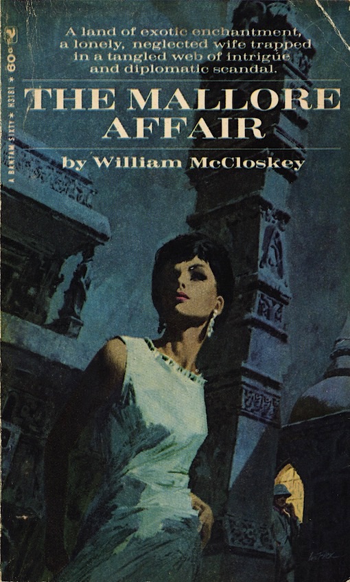
The Mallore Affair: " For Meg Nolan, it began almost like a fairy tale; a sudden journey with her diplomat husband on his first assignment abroad to India, exotic land of elephants and maharajahs. But almost from the very first day things started to go wrong. Not content with being just another diplomat's idle wife, she tried to make friends with the Indian people. Everyone warned her, but she wouldn't listen to them. Slowly she found herself being drawn deeper and deeper into a strange, hypnotic world of cruelty and evil. Desperately she tried to pull back before it was too late, but she hadn't reckoned on the wicked malice of an American woman named Bess Soapes, who was determined to destroy her."
 |
| CLICK ON IMAGE TO ENLARGE |
 |
| CLICK ON IMAGE TO ENLARGE |
War Party (Bantam, 1975): "It's God's country, and the Devil's country. Where a hired killer cherishes a strange code of honor. A young miner hands dangerous freight--a fortune in gold and a beautiful woman--through treacherous territory. The town drunk wakes up one day--with the town deserted. Apaches bring a lone White woman a surprising gift. It's the great American West. Savage and sweet, two-fisted and big-hearted, like no other place on earth."
Bugles West (Bantam, 1968): "It started at Andersonville, when a trusted comrade betrayed Tom Logan to curry favor with his captors. But Logan survived. When the war was over, he headed West on a long relentless hunt for the man he was going to kill... "
Saddle by Starlight (Bantam, 1975): "Holley was a cattleman... not a gunfighter. But like every rancher in North Basin, he'd battled drought, floods, Indians, starvation, to build the Six-Up spread. Now, hired gunslingers squatted on his land, waiting for the signal to run everyone and everything off the range. But only one man was behind them--one man who stood to gain the wealth of the whole valley. Sam Holley had to find that man--and kill him!"

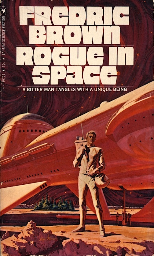
Feck's initial foray into science-fiction was on the cover of Fredric Brown's Rogue in Space, which Bantam published in August, 1971. It was such an assured genre piece that Bantam's insightful art director Leonard P. Leone Sr. knew he could trust Feck with an even bigger item, namely Star Trek 6 (April, 1972). That induced even more commissions for Star Trek's 8 and 4 (November, 1972, and April, 1973). Each title then went through multiple printings and they stayed in print with Feck's artwork for many years afterward. But what Bantam neglected to do was credit their illustrators, so fans had no way of knowing who was actually responsible for some of their favorite covers, though careful scrutiny usually revealed Feck's very legible signature lying about.
Rogue in Space: "Call him Crag, loner, thief, killer. He'd been a spaceman once and had a metal hand to show for it. He knew good from evil but cared not a grain of Martian sand for either. Until rogue met rogue..."
Star Trek 6: "Kirk, Spock, Bones and the others of the Enterprise find a deadly Eden, discover elemental life forces and planetary death wishes, and even meet Abraham Lincoln and Gengis Khan, as they speed through space on new assignments into the unknown."
Star Trek 8: "On their latest missions, Starship Enterprise and her crew journey to a glaciated wasteland where beautiful women rule; defeat the ferocious double of Captain Kirk on board the Starship; visit an eerie planet where it's always Halloween; and even dare to go beyond the edge of the galaxy."
Star Trek 4: "Six assignments in space and time: In the name of the Federation Council and the Starfleet Command, Spock and the Enterprise crew grapple with; a silicon based monster; an interplanetary spy; an amorous Amazon; a misguided mobster "boss"; a time-jumping technician; and the mind-enslaving elders of Talos IV, in the "Hugo" Award-winning episode "Menagerie."
Warner Books also took notice of Feck and hired him to do several covers for their science-fiction line. Nearly every one came out impressive. The die cast keyhole cover design and stepback illustration* on Thea Alexander's paperback novel 2150 A.D. (top) was so micro-macro cool that I purchased it immediately upon seeing it in a B. Dalton's bookstore in 1976. The lower cover is actually a 1981 reprint which I only recently obtained, with the stepback art now situated entirely on the outer wrap.
*Note: A stepback cover is an industry term for the single or double-page illustration located just inside or underneath the outer front wrap. A cover's die cast keyhole is a manufactured hole, often shaped or placed specifically so that it provides a "key" glimpse at a desired section of the stepback art underneath.
*Note: A stepback cover is an industry term for the single or double-page illustration located just inside or underneath the outer front wrap. A cover's die cast keyhole is a manufactured hole, often shaped or placed specifically so that it provides a "key" glimpse at a desired section of the stepback art underneath.
"2150 A.D. Is it a time? Is it a place? Is it a dream? Is it reality? Come with Jon into this world that can be-- and find out!"
Here's an example of the dichotomy that often exists between an illustrator's original work and the reproduced image of it on a paperback cover. My copy of The New Atlantis, a Warner Books science-fiction anthology edited by Robert Silverberg, and featuring stories by Gene Wolfe (Silhouette), Ursula K. Le Guin (The New Atlantis), and James Tiptree Jr. (A Momentary Taste of Being), looks very nearly like it did when I bought it new in 1978. However, the color contrast between my cover and Feck's actual acrylic painting is noticeable, and speaks loudly to the inadequacies of scanning and printing processes back in the 1970's.
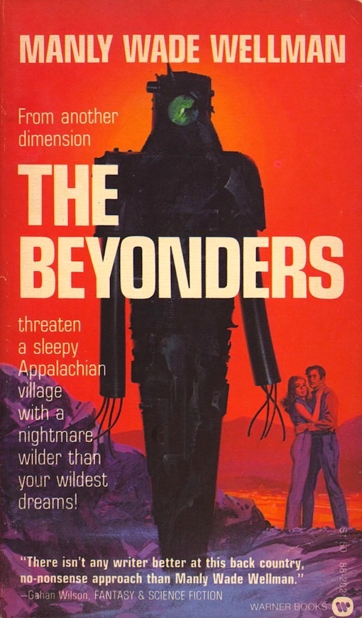
"The trouble in Sky Notch all started when that picture-painter Crispin came to town. Such a nice fellow, fitted in real well. Doc invited him to dinner; Slowly Kimber square-danced with him. And he even got Captain Kimber to let him come watch a clan baptism ritual up in the hills! Gander eye Gentry, who had his eye on Slowly, had his eye on Crispin too. Yet even he never linked Crispin with the creature he'd glimpsed in the hills--the thing that left a trail of burnt grass in its wake. And Crispin was an important part of the terror when the most down-to-earth of villages was menaced by something Unearthly... "
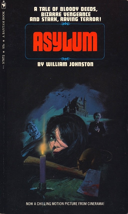
Feck surrounded an attractive female with macabre, terrifying elements on Bantam's novelizations of Amicus Studio's Asylum (December, 1972) and The Vault of Horror (July, 1973), creating a kind of dread atmosphere in the process. Feck was always good at grabbing a viewer's attention while still extrapolating a book's content, which is exactly what publishers wanted from their artists. I just wish Feck would've produced more horror covers.
Asylum: "Black magic, murder, and madness-most-bizarre stalk the tortured inmates of Dunsmoor, a mental institution in which life is a torment of horrors and death is the most desirable escape... ASYLUM, A New Experience in Heart-Stopping Terror! A macabre new film from Cinerama!"
The Vault of Horror: "Welcome to Death's waiting room, a vault of impenetrable concrete in which five doomed strangers seek comfort in confession only to discover that even more chilling evils await them..."
 |
| CLICK ON IMAGE TO ENLARGE |
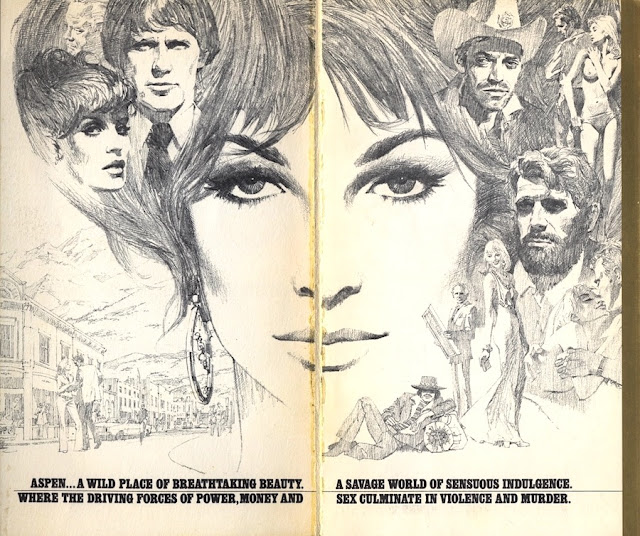
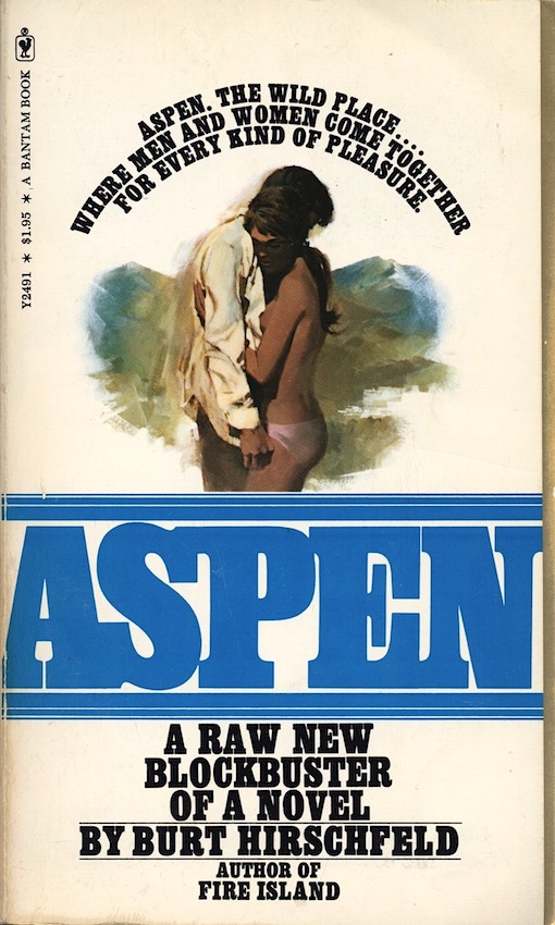
Feck produced a tightly sketched graphite montage for the stepback cover on Burt Hirschfeld's contemporary novel, Aspen, which Bantam published in 1976. You might recognize the people as familiar actors of the time, yet when the novel was adapted the following year into a TV mini-series none of those folks were cast. Was it wishful thinking on Feck's part, or was he just bent on drawing some celebrity faces?
"Aspen: A lusty sprawling canvas of raw, real life... Aspen: A needle-sharp sense of where and what the action is Now... Aspen: A story as jet-propelled as the men and women it describes... Aspen: the wild place... where pleasure is the first resort."
As time went on Feck continued to perfect the art of montage. He had plenty of opportunities to do so as Leone was forever assigning him espionage thrillers. For Irving Wallace's The Pigeon Project (Bantam, 1980), Feck highlighted the pastel colors of Venice, Italy, and one very handsome public relations man. To set the stage for Craig Thomas's Snow Falcon (Bantam, 1981), Feck placed a pair of international flags behind a ushanka donned, binocular strapped agent, modeled by actor Steve Holland.
The Pigeon Project: "The secret. Every man and woman has dreamed about it. Now it's within reach... and they'll do anything to possess it. The screen goddess. The contessa. The wily priest. The American public relations man looking for a cause. And his lover who may die for it. They are all caught between life's wildest dream... and death."
Snow Falcon: "Someone is plotting to undermine the Soviet bureaucracy. Someone is conspiring to explode the delicate, tense negotiations for a third SALT agreement--a treaty bitterly opposed by the Red Army. Someone is planning moves that will affect not only the stability of the Russian government, but also the future of world peace."
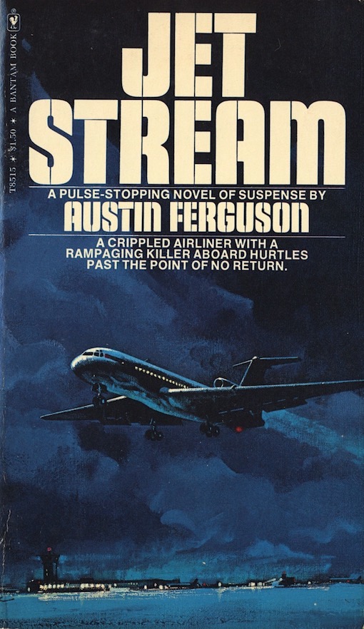
Feck was one of most dependable producers of cover art for adventure novels and thrillers during the last decade of his life. He was especially adept at illustrating planes, trains, ships, submarines and even blimps, and he often framed them in a field of robust color. Two examples of this are on Austin Ferguson's Jet Stream (Bantam, 1974), and Martin Caidin's Three Corners to Nowhere (Bantam, 1975). His penchant for painting transportation machinery may have stemmed from his time in the military ferrying airplanes at the close of WWII, and then in civilian life pleasure sailing along the Eastern seaboard.
Jetstream: "The worst blizzard of the year is howling down from Canada. The pilot is under an emotional strain. There is a serious malfunction in the plane's hydraulic system--and a desperate man is about to make a move that could cost the lives of everyone on board."
Three Corners to Nowhere: "In perfect weather, a plane flies into the mysterious Bermuda Triangle--and disappears. The U.S. government has lost a secret project director. A wealthy man has lost a beloved daughter. And an insurance company stands to lose 62 million dollars. After five days the official investigation is closed. But special investigator Dale Fenton has just begun..."
Three Corners to Nowhere: "In perfect weather, a plane flies into the mysterious Bermuda Triangle--and disappears. The U.S. government has lost a secret project director. A wealthy man has lost a beloved daughter. And an insurance company stands to lose 62 million dollars. After five days the official investigation is closed. But special investigator Dale Fenton has just begun..."
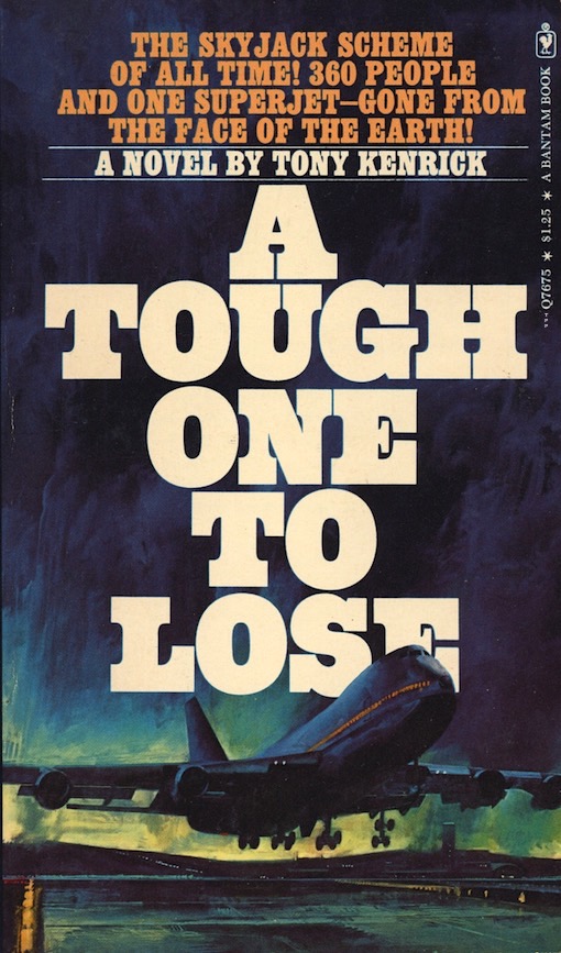
The cover of Tony Kenrick's A Tough One To Lose (Bantam, 1978) shows a Boeing 747 gently lifting off the runway. The cover of Craig Thomas's Rat Trap (Bantam, 1979) shows a Boeing 707 screaming after its liftoff. Thomas's aviation thriller with Feck's cover art proved to be so popular that it was reprinted several times. The same can't be said for Kenrick's thriller, Feck's cover art notwithstanding, but the book certainly deserved reprinting--it's one helluva caper written in the best Donald Westlake style.
A Tough One To Lose: "$25 million ransom! For a gang with an absolutely foolproof method of collection. $100,000 reward! For a down-at-the-heels young lawyer determined to unravel the mystery and the one unknown element that could cost the lives of 360 people!"
Rat Trap: "Emergency. The red light flashes the warning... The sudden cold pressure of a gun barrel against his jaw and the captain of the Boeing 707 knows the word--Terrorists are hijacking his plane--The rat trap is sprung. The stakes are heavy. Not merely the multi-million-dollar jet but human lives. Seventy-two frightened passengers and the entire flight crew. Their futures balance on the shim and madness of psychopathic killers who hold all the cards..."
Feck crashed a Boeing C-97 Stratofreighter on the bottom of a Colorado lake for Clive Cussler's classic thriller Vixen 03, which Bantam published in October, 1979. The artwork on this paperback was carried over from the hardcover (also by Bantam), which constituted one of Feck's major hardcover commissions.
"The plane, bound for the Pacific, vanishes carrying 36 Doomsday bombs--canisters armed with quick death germs of unbelievable potency. Vixen has in fact crashed into an ice-covered lake in Colorado. The climax is swift, crazily violent and shatteringly unpredictable--it's pure Clive Cussler!"
 |
| CLICK ON IMAGE TO ENLARGE |
Nobody in their right mind wants to be on a train that derails, especially if it plunges into the Hudson River. Not me anyway. Feck recreated the sunken aftermath of such a scenario for Clive Cussler's exciting adventure novel Night Probe! Bantam published this paperback in April, 1982, but the artwork was originally commissioned for the hardcover edition a year earlier where it didn't get unduly compromised by excessive text, titling and that awful oversized barcode that you see here.
"... With the future of virtually every person in the world at stake, Dirk Pitt is enlisted to spearhead his most daring mission yet--the rescue of a vital document for the United States. For an energy-starved, economically-devastated America, possession of this document is worth billions. But to Great Britain, it's worth a war. Pitt's quest plunges him into a head-to-head confrontation with Britain's most cunning secret agent--and into the throes of a torrid love triangle. As time runs out for a desperate America, Dirk Pitt races towards an underwater clash more terrifying than anything Clive Cussler has ever created--the breathtaking climax of NIGHT PROBE!"
 |
| CLICK ON IMAGE TO ENLARGE |
For the cover of Martin Caidin's World War II novel Whip (Bantam, 1977), Feck depicted a swarm of B-25 Mitchell's on a thrilling beachhead strafing mission. Several years back Feck's original 34" x 24" acrylic on masonite painting was put up for sale by owner Marc Witz. The asking price back then was $2500, or best offer. Worth every penny in my book.
"He was a fugitive hood when flying lifted him from the gutter and made him the wildest, most reckless air ace in World War II. His explosive heroism earned him command of a crack unit of daredevil pilots that became known as the Death's Head Brigade. But even their raw, nerveless courage couldn't stop the bloody juggernaut of the Japanese strike force. Until the day they mounted heavy firepower on a B-25--and the skies were shattered by the screaming killer angel they called... Whip."
Feck produced one of his most memorable illustrations for the paperback edition of Black Sunday
(Bantam, 1976), the debut novel of famed Silence of the Lambs author Thomas Harris. Fecks' stadium
smashing blimp blew the helium right out of Putnam's earlier hardcover edition jacket art.
"An international terrorist organization vows to revenge against the American people--a death plan without parallel. The diabolical scheme develops with breakneck speed, all of the explosive elements racing the clock to a shattering climax at the Super Bowl."
 |
| CLICK ON IMAGE TO ENLARGE |
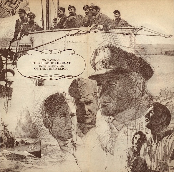
Feck's simple yet very effective painting of a German U-96 submarine rising to the surface of the sea on the cover of the first U.S. paperback edition of The Boat (Bantam, 1976), by best-selling German author Lothar-Gunther Buchheim, is in a word, outstanding. I've collected dozens of submarine covers over the years, but this one remains my favorite. Feck also sketched a detailed montage of the crew for the fold-out insert, and on its reverse side a detailed cutaway view of the boat. As I said--outstanding!
"From Germany--where it provoked a storm of controversy--comes this truly extraordinary novel about men at war. THE BOAT is the story of a World War II U-Boat and her crew, told with stunning force by Lothat-Gunter Buchheim, who served on one, who saw the worst and who has remembered every detail with a blazing obsession. Of the 40,000 men aboard German submarines, 30,000 never returned. Filled with unbearable urgency and excitement, this is more than a novel about war at sea, although it records the brutal details of death in battle. This is the fearful tale of men in mortal danger, a celebration of human endurance that, in its compassion, its beauty and its power, compares with ALL QUIET ON THE WESTERN FRONT. Acclaimed--and damned--for its devastating candor about Germany's fighting men, this is a supreme novel about World War II by a man on the other side."
 |
| CLICK ON IMAGE TO ENLARGE |
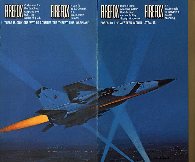
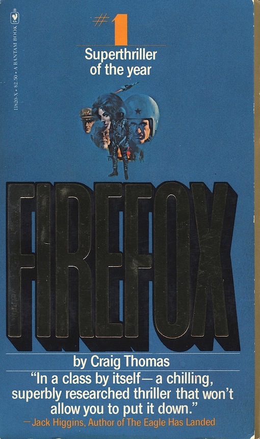
In 1984 Clint Eastwood produced, directed and starred in the aviation techno-thriller Firefox, which was loosely based on Craig Thomas's bestselling novel of the same name, published by Bantam in 1978. Over 20 million dollars were spent on special effects alone, a vast sum for any film being made at that time. In the film the Russian MIG-31 Firefox was designed to look like a radicalized version of the North American XB-70 Strategic Bomber, but Feck's interpretation, as seen on the paperback's stepback cover, was more in line with Thomas's actual description: a stylized upgrade of a Russian made MIG-25 Foxbat supersonic interceptor reconnaissance plane.
"Firefox. Codename for the deadliest warplane ever built, the Soviet Mig-31. Its lethal weapons system is controlled by pilot thought-impulses. So invincible it could wipe America out of the skies. The explosive novel about the most daring hijack mission ever."
 |
| CLICK ON IMAGE TO ENLARGE |
 |
| CLICK ON IMAGE TO ENLARGE |
Bantam was always ahead of the curve in paperback design and marketing strategies. Foil titling, embossed covers, stepback covers, fold-out covers and illustrated fold-out inserts were just some of the visual elements used to lure buyers. Some inserts even had content on both sides. In the 20th Century paperbacks were like miniature art objects, and when they were new in stores and featuring attractive artwork they practically waylaid customers. Feck's artistic contributions for Martin Caidin's novel Aquarius Mission (Bantam, 1978), definitely represent the best of what Bantam was trying to accomplish back then.
"Many miles deep--where giant eels generate megaton power. Many miles deep--where the discovery of a spectacular civilization holds the key to the survival of mankind."
Feck's cover art for both Walter M. Miller, Jr.'s novel A Canticle for Leibowitz (Bantam, 1977), and Edward Bryant's fix-up novel Cinnabar (Bantam, 1977), may have been influenced somewhat by Richard Powers and Paul Lehr, the two most unique stylists in the entire art field. Regardless of that speculation, these paintings are still extraordinary, singular works of art.
A Canticle for Leibowitz: "By the time of the 32nd Century, the atomic Flame Deluge was over. The earth was dead. All knowledge was gone. In a hellish, barren desert, a humble monk unearths a fragile link to 20th-century civilization. A handwritten document from the Blessed Saint Leibowitz that read: pound pastrami, can kraut, six bagels--bring home for Emma."
Cinnabar: "Across the borderline of time and space... A magic city of infinite possibilities... To experience the magic of Cinnabar... use this book as your map. Here are some of your traveling companions: Tourmaline Hayes, Network sex star. Obregon, the star scientist of the anti-city. Leah Sand, melancholy media artist. Jade Blue, the computer-womb-born catmother. Cougar Lou Landis, once a pudgy kid, now the last hero. Sidhe, the great white shark that sprang from oceans 350 million years deep!"
 |
| CLICK ON IMAGE TO ENLARGE |
Bantam published Hank Searls's novelization of Jaws 2 in April, 1978, two months before the film opened in theaters. Readers were given a choice between two variant covers by Feck; one with a skier and one without. You can clearly see where the removal of the skier by the art department left behind a blurry water-splash in her stead. Though Bantam quickly saw the error of their way and on all subsequent printings only the original unexpurgated cover was used.
If Lou Feck has any recognition outside of book publishing it's undoubtedly because of Jaws 2. The painting he created for the novelization was in turn used for the movie's poster, a rare double commission as it were. Feck's illustration, which pays tribute to Roger Kastel's original paperback cover art on Peter Benchley's bestselling novel Jaws (Bantam, 1975), is now part of our nation's entertainment legacy.
"Now, we dare you to pick up this book. It is a reading experience
with a climax you will never forget. A novel of paralyzing terror that
will grab you from the opening chapter..."
If you like beasts with big bites like I do, then you will appreciate Lou Feck's ferocious illustration on Man-Eater, (Bantam, 1977), a horror-thriller written by Ted Willis, the incredibly prolific British playwright, screenwriter and novelist.
And yes, it is true--some tigers really do have pink noses.
"Someone unlocked the cage and set a pair of tigers loose on the unsuspecting countryside. The first victim was a philandering husband on lovers' lane. The next was a girl who wandered too far from her picnic. Suddenly the suburb exploded with horror, exposing the raw passions and viscous secrets locked inside the quiet community. While outside, the cats continued to prowl..."
The fold-out cover painting on Arnold Federbush's disaster novel Ice!, is one of the most remarkable illustrations ever crafted for a paperback book. It's Lou Feck's crème de la crème, his magnum opus. For a limited time Bantam offered an 18" x 18' full color reproduction
of the cover suitable for framing. They were just $10, but I
foolishly didn't buy one even though I had already placed Feck on my
radar because of Kull, which ironically, was also offered as a print.
"Two young people in love, Mark and Karen, battle for survival in a
world that has become hell frozen over... New York buried under the New
Ice Age... The Big Freeze swirling wild, dangerous winds across the
Arctic oceans... across the Humboldt Glacier... In a flash it grows,
creeps outward, gathers force, becomes gigantic, imperils the world. How
long can people survive? Is this the way the world ends... Buried in
ICE?"
For the 1981 mass-market paperback edition of Walter Tevis's Nebula nominated novel Mockingbird, Bantam's art director Len Leone instructed Feck to go back to his easel and rework his classic New York City skyline into a blazingly different post-apocalyptic vision. With such an iconic image now promoting Mockingbird, book sales exceeded expectations--and Feck had another magnum opus on his hands.
"Mockingbird: A world where humans wander, drugged and lulled by electronic bliss. Where quick sex is best, where people would rather burn themselves alive than endure. A dying world of no children, no art, no reading. Where some still refuse to surrender. And love is the only hope. Mockingbird: A strange love triangle. Spolforth, the most perfect machine ever created, whose only wish is to die. Paul and Mary Lou, whose passion for each other is the only future. Mockingbird: A haunting novel, reverberating with anguish. That beats the force of life. And celebrates joy and love, the strength of hope, the force of the word, and the magic of a dream."
Even though "strong" women in science-fiction and fantasy art had already been well established by a medley of talented artists, some going back to the early Pulp era, no one but Feck had ever bathed them in such sensuous color values. High Couch of Silistra, The Golden Sword, Wind from the Abyss, and The Carnelian Throne (Bantam, 1981), are four outstanding covers that Feck produced in 1980 for the 2nd editions of Janet E. Morris's science-fiction series Silistra. Taken individually, or as a group, they are undeniably strong, yet unabashedly gorgeous.
High Couch of Silistra: "Her sensuality was at the core of her world. Her quest was in galaxies beyond the civilized stars. Somewhere deep in the heavens of a terribly distant tomorrow was the one man whose will conquered her own."
The Golden Sword: "She had the power to create planets. The sixty carved bones of the Yris-tera foretold her ancient fate. Her heritage of power took her beyond time and space and stole from her the one man she loved."
Wind from the Abyss: "In his keep, she was prisoner and lover. He had taken her powers and her body. In a still untenanted world of her making, he would challenge the gods who had fathered them to win control of his fate and their son."
The Carnelian Throne: "Estri was a god, and the daughter of light. Chayin was a god, and the son of darkness. Sereth was hase-enor, the son of all flesh. Lovers and friends, could they be the prophesied three who would wield the Sword of Severance, Se'Keroth, and bring light out of dark?"
In 1980 Feck produced my favorite cover art of his. It was created to embellish a comparative-historical novel by William C. Heine, a relatively unknown Canadian writer. It was titled The Swordsman. Bantam published it as a paperback original in April of that year.
"He began as a shipyard slave. He killed to win his freedom. And rose to become seafaring master of a trading empire that reached from ancient Tyre, across the teeming Mediterranean world, to the magnificent city of Carthage, ruled by Baal, a deify served by human sacrifice. Now, in a monumental saga of adventure and sensual pagan pleasures--a story as vast and exotic as SHOGUN--the Swordsman voyages across uncharted seas to the strange unknown land of the Maya...where he is greeted as a golden god from the sea."
Every aspect of Feck's painting is impressive: the beautifully sculpted figures standing majestically on the prow; the sleek vessel and its reflection on the glassy surface of the water; the teals with their fluttering wings; the towering landmass looming ominously in the background (could it be a volcano?); the analogous color scheme with its gradations of light and tone; and finally, the clean painterly brushwork bolstering everything that is depicted.
Feck's vivid scene harks back to the Captain Sinbad movies I loved as a child. Sinbad was my hero back then, and still is; a man capable of slaying monsters and winning the hand of every beautiful woman he met. The ultimate swashbuckler! I wanted to live like Sinbad too and travel to exotic destinations. I mean, what boy wouldn't! As for Feck's The Swordsman, well, the same thing goes--I mean, who wouldn't want to be THAT GUY, on THAT SHIP, with THOSE WOMEN!
LOU FECK was a creative illustrator who every editor could rely upon to deliver smart, realistic, and sometimes brilliant images, and for practically every genre application that there was in publishing. During the last ten years of his life he was almost unrivaled by any other book cover artist for sheer output and perhaps even diversity of subject. The only area besides horror that he didn't lavish enough attention on was sword & sorcery and fantasy, though he seemed poised to move strongly in that direction before his sudden passing. Alas, it was just not meant to be.
But wait!
If Feck had already embraced sword & sorcery with his masterful Kull painting, is there a chance that there could be additional covers by him in that genre that have gone uncredited?
Why yes! I do believe there is!
In a future post tentatively titled, LOU FECK AND THE MYSTERY OF ZORIN, I'll be examining the circumstances surrounding three dubious covers that surfaced in 1981. If you're a scholar or even just a fan of Robert E. Howard's famed character Conan the Barbarian you may find it of interest.
In a future post tentatively titled, LOU FECK AND THE MYSTERY OF ZORIN, I'll be examining the circumstances surrounding three dubious covers that surfaced in 1981. If you're a scholar or even just a fan of Robert E. Howard's famed character Conan the Barbarian you may find it of interest.
[Originally published in 2012. Revised, April, 2018, © Jeffersen]














4 comments:
I have a 1972 copy of Walter Miller's " A Canticle for Leibowitz" published by Bantam with the cover art by Lou Feck. One of his best pieces I think. Anyway I am trying to find out where his archives are stored. I would like to see the original painting for this cover and any studies he did for it. Any thoughts?
Thanks,
Mark
I don't know if Feck's artworks have been donated to any one institution or gallery. I suspect that many of his paintings are in private collections, while others may have been absconded with while being stored at Bantam and elsewhere. Several years ago I asked Bob Larkin about that very same thing: he thought that Feck's widow might have the majority of his paintings and drawings, or at least some of them. She is probably in her nineties by now if she's still alive (I don't recall her name or even where she lives). The photograph of Feck that I used in my posting I found on some artist info site, which of course eludes me now, but it was his son who provided it: his name is Mark Feck. If you can get in touch with Bob Larkin somehow he should be able to provide you with greater information. I believe he lives on Long Island, NY. There's a fan website where he perhaps can be accessed: http://boblarkin.blogspot.com/
Sorry I couldn't be of more help, but definitely good luck in your search, and keep me posted if you have any success. Feck was the catalyst that started me blogging about paperback covers.
Hello I have an original art paperback cover I’d like you to have a look at. I’ve been trying to determine artist since I bought it about 8 yrs ago. Thanks for your time.
> Anonymous. Sorry to take so long to respond, but yes, I would very much like to see your original cover art. Hopefully I can identify it for you (if it's Feck I probably can). Send an image of it via email to halfdene @ yahoo dot com.
Post a Comment