Saturday, August 4, 2018

GAVIN LYALL and the Avon Cover Artist who helped him fly

A FINE FELLOW in FINLAND purchased an art book from me back in 2016, and after calculating the shipping costs to his country, which were enormous if not outrageous ($49.50 for 3.2 pounds worth of item), I sent the book off on its epic journey to Scandinavia.

Earlier that morning I had selected an old paperback novel from a stack of books that I've been raring to read, and placed it on my nightstand for further use that evening. The book was The Most Dangerous Game by Gavin Lyall, an Avon reprint from September, 1969, which was originally published in the U.K. in 1963. It also happened to feature one of my favorite illustrated covers, by an as-of-yet unidentified artist.

My well used copy was in fact the only copy I've been able to procure in nearly two years of scrounging for one, so I was determined to read it gently so it wouldn't obtain any further damage (after all, there may not be another copy in existence that's anywhere near as acceptable as the one I have). Of course I knew nothing about the precise content of Lyall's novel, only that the terrific cover art promised aeronautical adventure, so that night when I started reading the opening paragraph it was completely without prescience:
"They were ripping up the Rovaniemi airport, as they were almost every airport in FINLAND that summer, into big piles of rock and sandy soil. It was all part of some grand rebuilding design ready for the day when the had enough tourist traffic to justify putting the jets onto the internal air routes. In the meantime, it was just turning perfectly good airports into sandpits."
How's that for concurrence? I had just finished serving a customer from FINLAND and then that very night I found myself reading a book that unbeknownst to me was actually set in Finland. While some folks might find that merely coincidental, it is in fact not. This form of likelihood has become all too commonplace around me. Example: I'll catch myself watching a DVD and taking note of a specific actor and the after the DVD ends I'll switch back to channel TV and lo and behold there's that same actor in some episode of a random series. Coincidence, or something else? Regardless, it happens all the time and it's always good for a raised eyebrow. Or a laugh!


I've been aware of British author Gavin Lyall (1932- 2003) for quite some time without really knowing anything about him other than the fact that he wrote Midnight Plus One (1965), a much lauded crime novel. According to Wikipedia, Gavin Lyall was a Pilot Officer in the Royal Air Force and flew Gloster Meteors. He also studied English at Cambridge University and was a journalist before becoming a novelist. But now, after having read The Most Dangerous Game, Lyall's second published novel, I can see why his reputation as a superior suspense novelist came about: this is an excellent, well-written adventure story, and completely worthy of the British Silver Dagger Award it sheathed as a runner-up in the best crime novel category.

One of Lyall's strengths seems to be in creating character type and dialogue. His protagonist is an ex-RAF pilot named Bill Cary, a hard-bitten man's man, who is trying to eke out a living by flying aerial surveys with his dilapidated de Havilland DHC-2 single-engined Beaver aeroplane. His current assignment: looking for nickel deposits in northern Finland, also known as Lapland. Cary is not above taking the odd assignment either, such as flying an eccentric American hunter to a restricted part of the Finnish/Soviet border. This all leads to knife fights, killings, downed planes, rescues, a lost treasure and undue scrutiny from the Finnish secret police. Cary also gets involved with the hunter's beautiful sister, who has flown over from America to find him.

Here's Lyall's first person take on a romantic encounter in a remote cabin in the Finnish forest, but one in keeping with Cary's leathery persona:
    "You're a weird one, Cary. What are you really wanting out of life?"
    I sat down beside her. She turned quite naturally so that her head was on my shoulder. I ran my hand gently through her hair. The cabin was quiet and close around us.
    "I want to find nickel," I said.
    She looked up at me with a wry smile. "Not gold or diamonds?"
    "Just nickel, I hear that some people make money just by finding oil."
    "It's happened." She moved her cheek gently against my hand. " And what'll you do when you find it?"
    "Get myself a new plane, or two. Maybe start a real company."
    She turned further and her breasts crushed against me and her hair was in my eyes, and I wanted her. Not hungrily or frantically, but very strongly and certainly. From loneliness, perhaps, but not the loneliness of the forest or of Lapland itself. And maybe because she carried her own loneliness with her, too.
    "Maybe I'll buy you a new plane after all," she said sleepily. "I could make money at it. I think you'd be a good risk."
    I lifted her head and kissed her and her body reached against me, strong and soft at the same time. And there was no world outside the cabin.
    Then she pulled firmly away and sat back on her heels; looking at me with her grey eyes wide and not at all sleepy now.
    "Just because I'm getting divorced," she said gravely, "doesn't mean I can be got just by grabbing."
    "I know: I'd get sued for a million dollars."
    "And don't get tough with me, Cary. I can't take much more."
    "Yes, you can." I reached and ran a knuckle down the sharp line of her jaw. She shivered suddenly and then caught herself.  I said: "You've got enough guts and singlemindedness for the whole United States Marines. If you hadn't, money would have loused you up a lot more than any one man could."
    "You pay the prettiest compliments." But her eyes relaxed. "You're a bit of a hard bastard yourself; that's why I think you'd be a good investment. But of course, you're only here to nine o'clock." She smiled lazily at me.
    "I thought that big business knows no hours."
    "You're learning, Cary. You're learning."
    She leaned slowly forward and I reached for her. And there was no hunger; just a gentle strength moving from loneliness to a great calm.
In my humble opinion that's solid, spare, almost pitch-perfect writing. And remember, this was only Lyall's second novel; eventually he would go on to write fourteen more, mostly in the adventure/espionage genre, spanning thirty-eight-years of his life.

Within days of finishing The Most Dangerous Game I found myself launched into another of Lyall's novels, one of two more that I owned in paperback. It was also from Avon, and it too had a great cover illustration by that same unknown artist.


The Wrong Side of the Sky was Lyall's debut and it was first published by Macfadden Books in the U.S. in 1963. Avon then republished it in August, 1969, the first of three Lyall novels that they would publish in consecutive order and with cover illustrations by that same unknown artist, and it too is an aeronautical adventure, about a freelance pilot named Jack Clay who is in hot pursuit of a jeweled treasure hidden somewhere among the islands of the Mediterranean Sea. His mode of transportation: a Douglas C-47 Dakota.

Lyall proved in his fledgling effort that he was pretty good at implementing description. Here's a prime example:
    Up above us, on our right, the hump and the village of little white houses looked very steep. A narrow-stepped path wound up and vanished behind the first cluster of the houses. Ahead of us, another path led through the wiry clumps of grass behind the sand. I had expected to find it marshy: it wasn't. There should have been a stream, but there wasn't that either. Probably the village had tapped it off, further back.
    I took the lead. The grass reached for about another hundred and fifty yards and was pretty flat and level until, as the valley sides began to close in, it rose up towards the cypresses.
    If there was a plane in among those trees I still couldn't see it. I didn't notice a thing until I was within twenty yards of the first tree. Then, suddenly it was there; an outline among the columns of the trees. It was one of the weirdest sights I ever saw.
    It was a Dakota, lying flat on its belly with its wings along the ground. It was pointed away from us, up the gentle slope, and turned slightly left, just as it had come to rest ten years before. In that time, the trees had grown up close around it, so that you could never see it from the air save by flying directly overhead, and then only by the faint outline defined by the trees themselves.
    Aeroplanes are my business, and Dakotas are my specialty---but not this one. When I stepped in among the trees the sounds of the sea behind me and the light and warmth of the sun were cut off as if a door had closed behind me. I felt very much alone. The trees were so thick that almost no sun would ever reach the ground in here, but the shadows had the same lucid quality as the light outside. And it was very still. There is nothing as still as a grove of thin straight trees, and no trees as still as these.
    In ten years the Dakota had taken on a green-grey shadowy colour that made it belong there. It didn't look as if it had crashed. It had come there, and it had meant to come there, and when it had come the trees grew up around it as part of it, and it had turned into something natural. It looked a thousand years old. It made me think of other groves where men were half goats and that this aeroplane belonged more to them than to me. It looked like a shrine. I began to get a prickly feeling in my hair.

Yup, Lyall could write. Even in the infancy of his career he could write, and this is as good a debut as you'll find from anyone.

In Lyall's third aeronautical adventure we are introduced to yet another "for-hire" pilot named Keith Carr, who's soaring over the Caribbean Seas in a short haul de Havilland Dove aeroplane. De Havilland Vampire Jets and an American B-25 Mitchell bomber also factor into Lyall's high flying plot about the attempted overthrow of a fictional South American dictatorship. Shooting Script was first published in 1967 by Avon, and it had a nicely composed cover design by famed book designer Milton Charles. Then in October, 1969, it was reprinted, but this time with an all new cover illustration by that unknown artist of mine, which of course also conformed to the other two Avon's published earlier that year.

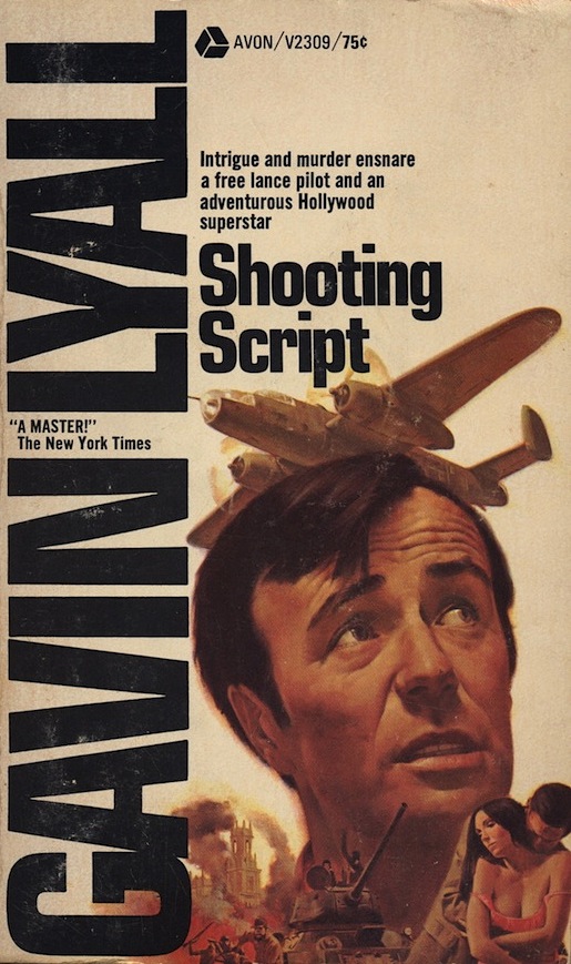
Below is an interesting action scene from Shooting Script where the Dove is being menaced by a Vampire. Inside the Dove's cockpit are Carr and Walt Whitmore, an American director and prospective client of Carr's. Whitmore was actually modeled after actor John Wayne, whom Lyall befriended during an actual film shoot:
    Whitmore twisted around, watching the Vampire over his shoulder. "You figure he's going to shoot?"
    "I figure on keeping out of his sights." Was that all I figured?
    We were below 1,500 feet now and still going down in wide spirals. But the Vampire had learned something, he'd positioned himself only about 500 feet higher this time and---as far as I could judge---he'd slowed down a lot. He circled in a gentle turn outside our spiral, waiting his moment.
    Keeping an eye on the Vampire, I put my right hand down on the flaps lever. "Get your hand on this," I told Whitmore. "When I say 'Flaps' I want it all the way down. But not before. Don't practice." I felt his big paw push mine aside.
    He said calmly: "Got it."
    I waited until the sun was where it wouldn't blind the Vampire or me, turned extra steeply for a few seconds, then straightened out as if I'd spotted where I wanted to go and was heading there direct.
    Come on, you bastard: try and bite me.
    He bit. He flipped over and came down in the classic "curve of pursuit," the long curling dive to end up sitting on my tail.
    I turned into and under him again---but now he was expecting that. He was moving slow enough to follow me. He tightened his diving curve, holding me easily, swinging smoothly into firing range.
    I leveled the Dove and pulled back the throttles. The Vampire slid behind my left shoulder, almost dead behind us. I yelled: "Flaps down!"
    The lever clicked in the silence. Then it was as I'd stamped on the brakes: the Dove collided with a soft pillow of air and bounced soggily upwards, into the Vampire's path.
    Suddenly he was on top of us.
    He reared like a startled horse, jerking into a wildly tight turn. His wings blurred with mist, condensing in the shattered airflow, the flicked level as he stalled out. He shuddered past a few yards to the left and I caught a glimpse of a helmeted hunched figure in the cockpit, fighting controls that weren't controlling anything any more. His nose began to swing inexorably downwards.
    A Vampire can lose over 2,000 feet in a gentle stall. This one had only 1,200 feet to lose---and he was as totally stalled as I've seen an aeroplane. There was nothing to do now but watch him die.
    To bale out of a Vampire 5 you dump the cockpit canopy, roll on your back and drop out---if you're still in control.
    I put the Dove's nose down, pushed up the throttles: we were close to stalling ourselves. Below, the cockpit canopy flashed off the Vampire, so perhaps he tried at the last second to jump. Then he was a burst of flame and a swelling cloud of smoke on the harsh green countryside. From inside the dove you couldn't even hear the bang.
These three novels have convinced me that Gavin Lyall was not only a consummate storyteller who could devise action, suspense, characters and thoroughly believable plots with equal parts aplomb, but he was also a damn fine aeronautical writer (a genre unto itself). Apparently, the United Kingdom Crime Writer's Association (home of the Dagger Awards) felt the same way as I do about Lyall, because in 1990 they selected Shooting Script as number 99 in their list of the Top 100 Crime Novels of All Time. 

NOW, about that still unknown cover artist:

I took initial notice of Lyall because of the excellent cover art on his Avon paperbacks, but determining who's behind the art is not always easy, especially without a legible or even visible signature (paperback publishers rarely cited their cover artists back in those days). The internet was not much help either, which forced me to try and employ an old-fashioned process of elimination instead. After pulling together more than a dozen paperbacks with comparable art, and by artists whose work I felt I could recognize with at least some measure of confidence, I began to systematically rule out names like Stanley Borak, Hector Garrido, Gordon Johnson, Sol Korby, Ron Lesser, Victor Livoti, and Frank McCarthy. That left me with only James Bama, Peter Caras, Don Stivers and Roger Kastel

My powers of observation were telling me to go with Roger Kastel, even though I knew Bama, Caras, Korby and Stivers both excelled at this type of portraiture. But I wanted actual confirmation, so I went out and bought four more Avon paperbacks from 1969 that appeared to use the same cover artist. They were all designed to correspond visually with the Lyall's (the fifth cover came later, but appears to be by the same artist). They are posted below:


CLICK ON IMAGE TO ENLARGE

  •  The Scavengers by Allan Nixon  (Avon, May, 1969) 
  • The Monument by James Kubeck  (Avon, June, 1969) 
  • The Luck of the Lonely Sea by Patrick O'Hara  (Avon, August, 1969) 
  • The Sea Chase by Andrew Geer  (Avon, December, 1969)
  • Johnny Kinsman by John Watson  (Avon, September, 1969)  (*Update: I been informed via a comment (seen below) that this cover was produced by SOL KORBY and verified at http://solkorbyillustrations.com/paperbacks.htm. Korby's artwork to me was always similar in style to Kastel's, especially back then, hence my confusion, but I still should've been more cautious before doling out credit. 

Remarkably, and thankfully, The Scavengers and The Monument both credit Roger Kastel as their cover artist, which pretty much sealed the deal as far as who the responsible person was. But to leverage complete certainty I went ahead and contacted Grace Kastel, Roger's wife, who graciously acknowledged that, indeed, all seven covers were the early work of her husband (*Johnny Kinsman is merely a guess on my part).

And remember my mention of designer Milton Charles? Well, it turns out that Kastel was the stepback cover artist for one of Charles's most successful creations: Pocket Book's 1976 paperback edition of Judy Blume's Forever. Yes, it's more of that reoccurring likelihood of mine.


As expected, the Lyall covers pushed my interest in Roger Kastel's work. Of course I had always been aware of him, and in fact I already owned maybe a dozen paperbacks with his covers including his most famous one, Jaws, but now I wanted to add to that number, and to my knowledge. So after several months of searching in used bookstores and on the net I was finally able to gather close to a hundred paperbacks with his cover art. I'll be highlighting many of these great finds in a future post titled: ROGER KASTEL, MUCH MORE THAN JUST THE JAWS ARTIST.

With the exception of his early 1960's covers, I can now say that I'm able to recognize most of Kastel's later cover illustrations with just a sustained glance. Knowledge, and nerdish concentration, is indeed, empowering.


[© 2016. Revised in August, 2018, Jeffersen]

Thursday, August 2, 2018

SNARLEODIELRENE...


Snarbodiehene... Jnarbodiehens... I give up!  It must be some foreign language.

Wait. Hold on a sec'...  I've got it now!

It's charlesdickens, or rather, Charles Dickens, his exact signature to be precise, or an interpretation of his signature by this particular publisher.

Ha! It can't be anybody else. It's embossed on the cover of one of his most famous books, A Tale of Two Cities. Clearly I was having one of those static, gray-cell moments that we all fear as we get older. But man, you have to admit, that's one loopy signature.

This edition was published by the John C. Winston Company of Philadelphia, circa 1915, although the illustrations are dated 1905 (that's probably because Collins Clear Type Press of London published this book first, while also commissioning the illustrations). It's bound in cordovan colored leather, letter embossed, and it has a silk ribbon and gilt top-edge. It measures 6 x 4 inches, which means it's pretty small, the size of a vintage paperback, making it ideal for collecting. 


The title page decoration above was done by Malcolm Patterson, but all of the other interior illustrations, seen below, were created by a different artist, one who signed as A. A. Dixon

Arthur Augustus Dixon
was born in London, England, in 1872. He trained at the Camden School of Art, and he was only 24 years old when he had his first exhibition, one of several it would seem, at the Royal Academy of Art. He also exhibited at the Royal Society of British Artists.

Dixon became primarily a book illustrator in his native country, and apparently a prolific one, producing covers and interiors for five decades. His first commission came from Ernest Nister in 1899, for The Holly Tree by Charles Dickens. Among his other publisher clients were Blackie & Sons, Collins Clear Type Press, Cassell & Co., James Nisbet & Co., Raphael Tuck & Sons, and in America in conjunction with Collins the John C. Winston Company. In addition to scores of children's books, he also illustrated dozens of Collins' re-issues of classic works by famous authors such as Jane Austen, Alexander Dumas, Nathaniel Hawthorne, Oliver Wendell Holmes, Victor Hugo, John Keats, Lord Lytton and Alfred Tennyson.

The Dictionary of British Book Illustrators of the Twentieth Century described Dixon's artwork as thus: "His book illustrations, mainly in full colour or half tone, were conventional and prosaic with sentimental overtones, but generally competent."

I suppose there are worse things to be called than conventional and competent. Dixon died in Berkhamsted, Hertfordshire in 1959, at the ripe old "conventional" age of 87.


BELOW are a few examples of Dixon's artwork in color. Curiously, whether by choice, circumstance or simple availability, religious themes and subject matter tended to dominate his assignment decision making, especially from about 1914 onward.


The Precious Gift, Bible Stories for Children. Theodora Wilson. Blackie, 1916

Jesus and the Blind Man. Date unknown, possibly from The Precious Gift

Children's Stories from Shakespeare. Raphael Tuck, 1919
 
David Copperfield. Charles Dickens. Collins Clear Type, 1920

Moses and the Promised Land. Theodora Wilson. Blackie, 1922

Tales of the Alhambra. Washington Irving. Raphael Tuck, 1924

Tales of the Alhambra. Washington Irving. Raphael Tuck, 1924

In His Footsteps. Theodora Wilson. Blackie. Date unknown

Mother and Child. Date unknown

The Visitation. Date unknown


I SUPPOSE most of us have drawn a religious scene or two in our time sitting at the drawing table. There's just something inherently calming about composing such serene pictures. I drew the one above, a pastel that got inadvertently folded and wrinkled during storage, way back in high school. Not my best drawing by any means, and made worse by the halo. Sheesh! What was I thinking? Oh yeah, I was having calm, peaceful thoughts. Something the world could use a lot more of these days.

So, if our man Arthur A. Dixon was deemed merely "competent" by scholars in his own field, how bad are the rest of us, that is, we amateur illustrators? Ha! I'm sure I don't really want to know!

PEACE OUT


[© August, 2018, Jeffersen]